7 Types of Website Layouts for High-Converting Online Stores

Designing an online store that actually helps your customers find products quickly can often feel confusing. With so many possible website layouts, it’s easy to get lost or end up with a cluttered look that puts shoppers off. If your site isn’t organised in a way that matches how people really browse, you could be missing out on valuable sales.
The good news is that certain layout strategies are proven to improve both visibility and customer experience. You’ll discover how patterns like grids and creative arrangements make your shop easier to use, more visually appealing, and better at turning visits into purchases.
Get ready to learn specific approaches that not only organise your content but also guide your customers directly to what matters most. Each method in this list has been chosen for its practical impact, so you can confidently design a site that stands out and helps your business grow.
Table of Contents
- 1. Grid Layout: Clean Structure for Product Discovery
- 2. F-Pattern Layout: Direct Eyes to Key Actions
- 3. Single-Page Layout: Smooth Storytelling on Landing Pages
- 4. Asymmetrical Layout: Stand Out with Creative Design
- 5. Z-Pattern Layout: Guide Shoppers Through a Clear Path
- 6. Split Screen Layout: Highlight Multiple Offers Effectively
- 7. Modular Layout: Flexible Blocks for Growing Catalogues
Quick Summary
| Takeaway | Explanation |
|---|---|
| 1. Use Grid Layouts for Clarity | Grid layouts enhance product visibility and create a clean browsing experience for users. Optimize for mobile by maintaining responsive designs. |
| 2. Implement F-Pattern for Key Actions | The F-pattern layout directs user attention to key information, improving navigation and conversion rates through strategic placement of content. |
| 3. Embrace Single-Page Layouts for Storytelling | Single-page layouts create a seamless user experience, guiding visitors through a narrative that encourages engagement and conversion. |
| 4. Harness Asymmetrical Designs for Engagement | Asymmetrical layouts break traditional norms to enhance visual interest, making a website memorable and engaging for users. |
| 5. Design Modular Layouts for Flexibility | Modular layouts allow for adaptable and scalable website designs, making it easier to manage content and improve user experience across devices. |
1. Grid Layout: Clean Structure for Product Discovery
Grid layouts represent a powerful structural approach for online stores seeking to maximise product visibility and user engagement. By systematically arranging products and visual elements into precise rows and columns, grid designs create an intuitive browsing experience that guides customers through your digital catalogue.
The core strength of grid layouts lies in their ability to provide a clean and organised visual hierarchy. Modern grid design principles enable retailers to create balanced interfaces that help users quickly locate and evaluate products.
Key advantages of grid layouts include:
- Enhanced visual clarity and product legibility
- Consistent presentation across different device screen sizes
- Improved navigation and user experience
- Faster product discovery for time-sensitive shoppers
A well-designed grid layout transforms product browsing from a frustrating experience into an effortless journey of discovery.
Grid designs work particularly well for ecommerce platforms by allowing strategic placement of product thumbnails, pricing information, and call-to-action buttons. These layouts support responsive design principles, automatically adjusting column widths and spacing to suit mobile, tablet, and desktop screens.
When implementing a grid layout, consider these practical strategies:
- Use consistent image sizes for product thumbnails
- Maintain uniform spacing between grid elements
- Implement clear hover states for interactive product tiles
- Ensure mobile responsiveness with flexible grid structures
Expert tip: Conduct A/B testing on your grid layout to identify the optimal number of columns and product display settings that maximise user engagement and conversion rates.
2. F-Pattern Layout: Direct Eyes to Key Actions
The F-pattern layout is a strategic website design approach that leverages human reading psychology to guide user attention and boost conversion rates. By understanding how users naturally scan web content, online stores can strategically position critical information to maximise engagement.
Research on web user behaviour reveals that most people scan webpages in a distinctive F-shaped pattern. This means users typically read horizontally across the top of the page first and then move vertically down the left side of the content.
Key benefits of the F-pattern layout include:
- Intuitive navigation for users
- Improved visibility of critical call-to-action buttons
- Enhanced product discovery
- Reduced cognitive load for visitors
- Faster information processing
The F-pattern design transforms website browsing from a random experience into a structured journey of discovery.
To implement an effective F-pattern layout for your online store, consider these strategic placement techniques:
- Position key products and promotions along the top horizontal line
- Place navigation menus and primary categories along the left vertical axis
- Use compelling headlines and thumbnails to capture initial horizontal scanning
- Ensure critical information appears within the first two scanning areas
Website designers can further optimise the F-pattern by using visual cues like contrasting colours, strategic whitespace, and clear hierarchical design to naturally draw users’ eyes towards desired actions.
Expert tip: Conduct eye-tracking studies or use heatmap analytics to validate and refine your F-pattern layout design for maximum user engagement and conversion potential.
3. Single-Page Layout: Smooth Storytelling on Landing Pages
Single-page layouts represent a modern approach to digital storytelling that transforms how online stores communicate their value proposition. By creating a seamless scrolling experience, these layouts guide users through a compelling narrative designed to maximise engagement and conversions.
Comprehensive single-page design strategies reveal how this layout eliminates traditional page breaks and creates a fluid user journey. The design concentrates user attention by presenting information in a strategic linear progression.
Key advantages of single-page layouts include:
- Uninterrupted user experience
- Simplified navigation
- Improved mobile responsiveness
- Enhanced storytelling capabilities
- Faster content consumption
A well-crafted single-page layout transforms website visitors from passive readers into engaged participants.
Designing an effective single-page layout requires careful consideration of content hierarchy and visual flow. Strategic elements to incorporate include:
- Clear opening value proposition
- Progressive information revelation
- Visually distinct content sections
- Strategically placed call-to-action buttons
- Smooth scrolling interactions
The most successful single-page designs create a narrative arc that guides users effortlessly from initial curiosity to final conversion. Emotional storytelling and visual progression become critical components in maintaining user interest.
Expert tip: Implement micro-interactions and subtle animations to provide visual feedback and enhance user engagement throughout the scrolling experience.
4. Asymmetrical Layout: Stand Out with Creative Design
Asymmetrical website layouts represent a bold departure from traditional design conventions, offering online stores a powerful method to capture user attention and differentiate their digital presence. By intentionally breaking standard design symmetry, these layouts create visual intrigue that can dramatically enhance user engagement.
Modern asymmetrical design strategies reveal how carefully planned visual imbalance can transform user experience. The key is creating deliberate tension that guides the viewer’s eye without causing discomfort.
Key advantages of asymmetrical layouts include:
- Increased visual interest
- Enhanced brand memorability
- Improved product highlight capabilities
- Unique user experience
- Greater design flexibility
An asymmetrical design transforms your website from mere information display to an immersive visual journey.
Successful asymmetrical layouts require strategic implementation:
- Establish a clear visual hierarchy
- Use contrasting element sizes
- Create balanced visual weight
- Maintain consistent brand aesthetics
- Ensure responsive mobile adaptation
The most effective asymmetrical designs use strategic visual disruption to direct user attention precisely where you want it. By thoughtfully positioning key products or calls-to-action, you can create a dynamic browsing experience that feels both innovative and intuitive.
Expert tip: Use subtle grid lines and carefully balanced white space to prevent asymmetrical layouts from appearing chaotic or disorienting.
5. Z-Pattern Layout: Guide Shoppers Through a Clear Path
The Z-pattern layout represents a strategic approach to website design that follows the natural eye movement of online shoppers. By understanding how users visually consume digital content, ecommerce sites can create more intuitive and engaging browsing experiences.
Z-pattern design principles reveal how human eyes typically scan web pages from top left to top right and then diagonally down to the bottom left before moving horizontally again to the bottom right.
Key advantages of the Z-pattern layout include:
- Intuitive content navigation
- Improved user engagement
- Strategic placement of key information
- Enhanced conversion potential
- Natural visual flow
The Z-pattern transforms website browsing from a random experience into a carefully choreographed journey.
Implementing an effective Z-pattern requires thoughtful content placement:
- Position primary logo in top left corner
- Place key navigation elements across top right
- Insert primary call-to-action along diagonal path
- Add secondary information at bottom sections
- Ensure critical details align with natural eye movement
The most successful Z-pattern layouts use strategic visual hierarchy to guide users effortlessly through the purchasing journey. By anticipating and supporting natural scanning behaviours, online stores can create more compelling and user-friendly interfaces.
Expert tip: Use contrasting colours and subtle visual cues to reinforce the Z-pattern and subtly direct user attention through your website layout.
6. Split Screen Layout: Highlight Multiple Offers Effectively
Split screen layouts offer a dynamic and visually striking approach to presenting multiple product lines or promotional offers simultaneously. By dividing the website interface into distinct visual sections, online stores can create engaging experiences that capture user attention and showcase diverse offerings.
This innovative design strategy allows ecommerce platforms to break traditional layout constraints and present information in a more interactive and compelling manner. By creating visual symmetry or intentional asymmetry, split screen layouts can effectively communicate complex product narratives.
Key advantages of split screen layouts include:
- Enhanced visual storytelling
- Ability to showcase multiple product categories
- Increased user engagement
- Improved content hierarchy
- Memorable brand presentation
A well-executed split screen transforms passive browsing into an interactive visual journey.
Implementing an effective split screen design requires strategic consideration:
- Define clear visual hierarchy
- Use complementary colour schemes
- Ensure responsive mobile adaptation
- Maintain balanced visual weight
- Create seamless interaction between sections
The most successful split screen layouts use strategic visual segmentation to guide users through different product experiences without overwhelming them. By thoughtfully dividing screen real estate, online stores can create intuitive navigation paths that feel natural and engaging.
Expert tip: Use subtle hover effects and smooth transitions between split screen sections to create a more dynamic and interactive user experience.
7. Modular Layout: Flexible Blocks for Growing Catalogues
Modular layouts represent a revolutionary approach to ecommerce website design that enables online stores to create dynamic and adaptable digital experiences. By breaking content into flexible, interchangeable blocks, retailers can construct websites that effortlessly scale and evolve with their product offerings.
Flexible modular interface design provides unprecedented versatility for digital catalogues. These layouts allow seamless rearrangement of content blocks to match changing business requirements and user preferences.
Key advantages of modular layouts include:
- Exceptional content adaptability
- Simplified website management
- Enhanced user personalisation
- Improved responsive design capabilities
- Faster content updates
Modular design transforms websites from static pages into living digital ecosystems.
Successful modular layout implementation requires strategic planning:
- Define core content modules
- Establish consistent design guidelines
- Create reusable visual components
- Ensure cross-device compatibility
- Maintain visual hierarchy
The most effective modular designs leverage intelligent content organisation to create intuitive and engaging user experiences. By treating website elements as movable, scalable units, online stores can create more responsive and user-centric digital platforms.
Expert tip: Develop a comprehensive design system with predefined module sizes and interaction rules to maintain visual consistency across your modular layout.
Below is a comprehensive table summarising the various layout design strategies discussed in the article for optimising ecommerce websites.
Elevate Your Online Store with Expert Layout Design and Ecommerce Solutions
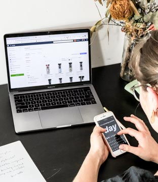
Creating a high-converting online store means choosing the right website layout that guides your customers seamlessly through discovery and purchase. Whether you are inspired by grid, F-pattern, or modular designs, the key challenge is to transform complex product catalogues into intuitive, engaging journeys. Many online retailers struggle with poor user experience, inconsistent mobile responsiveness, and missed conversion opportunities. At Big Eye Deers, we understand these pain points and specialise in crafting tailored ecommerce platforms that embody these proven layout principles with precision.
Discover how our UK-based ecommerce agency combines 17 years of Magento and Shopify expertise with user-focused design workflows using Figma to build secure, responsive, and scalable online stores. From optimising product discovery with Klevu search to supporting advanced B2B features and personalised account hierarchies, we help retailers stand out with layouts that truly engage shoppers. Start your journey to a refined digital storefront today at Big Eye Deers and explore our comprehensive design and build services. Elevate your ecommerce experience now with expert guidance and technology aligned to your growth.
Frequently Asked Questions
What is a grid layout and how does it benefit online stores?
A grid layout arranges products in rows and columns, enhancing visual clarity and simplifying navigation. Implement a grid layout to make product discovery effortless and ensure that your design adjusts seamlessly across devices.
How can I implement an F-pattern layout to increase conversions?
An F-pattern layout prioritises critical information in a way that aligns with natural eye movements, making key actions more visible. Position essential content along the top and left side of your website, and observe the increase in user engagement within a few weeks.
What are the advantages of using a single-page layout?
A single-page layout offers a continuous, smooth scrolling experience, which can improve user engagement and storytelling. Consider structuring your content to reveal information progressively, and aim for increased conversions by streamlining the user journey.
How do asymmetrical layouts enhance user experience?
Asymmetrical layouts create visual intrigue and can make your website stand out from competitors. To effectively implement this design, establish a clear visual hierarchy and balance elements to captivate users while maintaining intuitive navigation.
What elements should I focus on for a split screen layout?
A split screen layout allows you to showcase multiple offers side by side, promoting user engagement. Create distinct sections with a clear visual hierarchy and ensure they are responsive, aiming for an improved content presentation and user retention.
How can modular layouts benefit my ecommerce site?
Modular layouts provide flexibility by allowing content to be organised into interchangeable blocks. Start by defining core content modules, and you’ll find your website becomes easier to manage and update, enhancing user experience and adaptability.
Recommended

Adobe Commerce (Magento)
Formerly known as Magento, Adobe Commerce is built for complex catalogues, integrations, and long term growth. We design and develop stable, scalable stores that support demanding eCommerce requirements, including multi-store setups, complex pricing, and Hyva based performance improvements.

Bespoke Build
We design and build custom eCommerce platforms for businesses with complex workflows, integrations, or non standard requirements. Built from scratch around your business needs using Laravel and modern architectures.

Working with brands across the UK from our offices in Cardiff and Exeter, you deal directly with a senior team of designers and developers specialising in Shopify, Magento, WordPress and bespoke eCommerce platforms.
We focus on commercial outcomes. Better conversion rates, strong SEO foundations and eCommerce platforms that continue to improve long after launch.