Master mobile responsive design for ecommerce success

Many ecommerce managers confuse mobile-friendly sites with truly responsive design, risking lost mobile sales as 60% of UK users now primarily browse via mobile devices. Mobile responsiveness is critical for effective ecommerce performance. This guide explains what mobile responsive design means and how it benefits your UK online store through improved user experience, stronger SEO rankings, and increased conversions across all devices.
Table of Contents
- Understanding Mobile Responsive Design
- Business Case And User Experience Benefits
- SEO Impact Of Mobile Responsive Design
- Common Misconceptions About Responsive Design
- Technical Components And Best Practices
- Implementation Guidance For Magento And Shopify Ecommerce
- Future Trends And Evolving Practices In Responsive Design
- Summary And Practical Next Steps
- How Big Eye Deers Can Enhance Your Responsive Ecommerce
Key takeaways
| Point | Details |
|---|---|
| Responsive design adapts dynamically | Automatically adjusts ecommerce sites to all device screens without separate mobile versions. |
| Improves retention and conversions | Enhances user retention by 30-40% and boosts conversion rates significantly. |
| Google mobile-first indexing matters | Search rankings depend on mobile site performance, making responsiveness vital for visibility. |
| Technical foundation is critical | Flexible grids, media queries, and responsive images form the core technical components. |
| Platform-specific optimisation works | Magento and Shopify stores benefit from tailored responsive design implementation. |
Understanding mobile responsive design
Responsive design is a dynamic website layout approach that adjusts automatically to fit any device’s screen size. Unlike static mobile-friendly sites, responsive web design ensures a website adapts fluidly using flexible grids, media queries, and responsive images, with over 90% adoption among websites. This approach creates seamless experiences across mobile, tablet, and desktop without requiring separate site versions.
The technical foundation rests on three core concepts:
- Flexible grids using fluid containers that expand or contract based on screen width
- CSS media queries triggering style changes at specific breakpoints
- Responsive images that resize or swap based on device capabilities
For ecommerce managers, this means customers receive consistent branding and functionality whether browsing on a smartphone during their commute or completing purchases on desktop at home. Understanding responsive web design essentials helps you evaluate whether your current site truly adapts or merely scales. The distinction matters because proper responsive implementation directly impacts responsive design ecommerce performance metrics that drive revenue.
Pro Tip: Test your site by resizing your browser window. If content reflows smoothly without horizontal scrolling, you have responsive design. If elements break or require zooming, you need improvements.
Business case and user experience benefits
Mobile traffic comprises 60-85% of ecommerce visits, making mobile optimisation essential rather than optional. Responsive sites deliver measurable business advantages that directly impact your bottom line. Responsive design increases user retention by 30-40%, translating to higher conversion rates and customer lifetime value.

Speed plays a crucial role in retention. Faster load times on responsive sites reduce bounce rates significantly, keeping potential customers engaged long enough to browse products and complete purchases. Poor mobile experiences drive visitors straight to competitors who have prioritised responsive performance.
Cost efficiency represents another compelling advantage. Responsive design reduces development costs by using a single adaptive site instead of maintaining separate desktop and mobile versions. You avoid duplicating content management, security updates, and feature deployments across multiple platforms. This streamlined approach frees resources for growth initiatives rather than maintenance overhead.
Key business benefits include:
- Lower bounce rates through faster, more intuitive mobile experiences
- Higher average order values when customers can easily browse full catalogues on any device
- Reduced cart abandonment as checkout flows remain smooth across screen sizes
- Simplified analytics tracking with unified user journeys instead of fragmented cross-device data
Pro Tip: Monitor your analytics to identify pages with high mobile bounce rates. These represent quick wins where responsive improvements deliver immediate conversion gains.
SEO impact of mobile responsive design
Since 2016, Google primarily indexes and ranks websites based on their mobile version, fundamentally changing SEO priorities. Non-responsive or mobile-unfriendly sites risk lower search rankings and reduced organic traffic, directly impacting ecommerce growth opportunities. This mobile-first indexing policy means Google evaluates your site’s mobile performance before considering desktop experience.
Responsive design improves discoverability through several mechanisms. Fast-loading mobile pages satisfy Google’s Core Web Vitals requirements, earning ranking boosts. Single URL structures for responsive sites avoid duplicate content penalties that plague separate mobile domains. Consistent user experiences reduce bounce signals that Google interprets as poor quality.
For UK ecommerce stores competing in crowded markets, mobile optimisation is essential for competitive advantage. Your responsive design ecommerce performance directly influences whether potential customers find your products when searching on mobile devices. Sites that load slowly or display poorly on smartphones simply disappear from mobile search results, handing market share to more technically capable competitors.
The compounding effect matters too. Better mobile rankings drive more traffic, which generates more engagement signals, which further improve rankings. This virtuous cycle rewards early investment in proper responsive implementation. Delaying responsive improvements means falling further behind competitors already benefiting from stronger mobile SEO.
Common misconceptions about responsive design
Several widespread misunderstandings confuse ecommerce managers evaluating mobile strategies:
- Mobile-friendly equals responsive: Mobile-friendly sites are simplified static versions of desktop sites, whilst responsive sites dynamically adapt layouts and content. Mobile-friendly typically means a separate m.domain that shows stripped-down content. Responsive means one site that intelligently reflows for any screen.
- Responsive design only affects appearance: Beyond visual layout, responsive design improves SEO rankings, user retention rates, and operational cost efficiency. The technical foundation supporting responsive layouts also enables faster load times and better accessibility.
- Separate mobile sites are simpler: Maintaining distinct desktop and mobile sites increases costs through duplicated content management, separate SEO efforts, and inconsistent user experiences. Customers who switch devices mid-journey encounter different interfaces and often lose cart contents.
- Responsive design limits creativity: Properly implemented responsive design allows device-optimised layouts without compromising brand identity. You can deliver touch-optimised navigation on mobile whilst preserving detailed product galleries on desktop. Modern CSS capabilities enable sophisticated adaptive experiences that enhance rather than restrict design possibilities.
Understanding responsive web design essentials helps dispel these myths. The confusion often stems from outdated information or incomplete implementations that give responsive design an undeserved reputation for complexity.
Technical components and best practices
Successful responsive implementation requires attention to specific technical elements. Using the meta viewport tag with width=device-width and relative CSS units like %, em, rem rather than fixed pixels is crucial for responsive layouts. This viewport meta tag belongs in every page’s head section, ensuring browsers render content at appropriate scales.
CSS media queries form the backbone of responsive behaviour. These conditional rules apply different styles based on screen width, orientation, or resolution. For example, you might display three product columns on desktop but switch to single-column on mobile for easier scrolling and tapping.
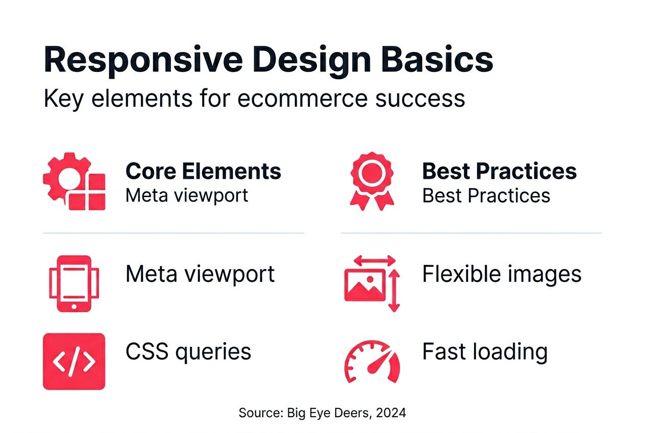
Responsive image techniques prevent mobile users downloading unnecessarily large files. The srcset and sizes attributes let browsers select appropriately sized images based on device capabilities. This optimisation dramatically improves load times on mobile networks whilst preserving visual quality on high-resolution displays.
Frameworks like Bootstrap and design tools like Figma help streamline responsive ecommerce development. Bootstrap provides ready-made grid systems and components that handle common responsive patterns. Figma enables prototyping responsive layouts and testing user flows before writing code, reducing expensive development iterations.
Key technical practices include:
- Setting breakpoints based on content needs rather than specific device dimensions
- Testing touch target sizes to ensure buttons and links work easily on mobile
- Optimising font sizes for readability across screen sizes without requiring zoom
- Implementing progressive web application features for app-like mobile experiences
| Component | Desktop Implementation | Mobile Implementation |
|---|---|---|
| Navigation | Horizontal menu bar | Collapsible hamburger menu |
| Product grids | 3-4 columns | 1-2 columns |
| Images | High resolution | Optimised smaller files |
| Forms | Multi-column layouts | Single-column stacked fields |
Pro Tip: Use browser developer tools to simulate different devices and network speeds. This reveals performance bottlenecks and layout issues before real customers encounter them.
Implementation guidance for Magento and Shopify ecommerce
Magento Open Source and Adobe Commerce offer built-in responsive features whilst Shopify themes are optimised for responsive performance. Both platforms provide solid foundations, but successful implementation requires platform-specific approaches.
For Magento stores, leverage flexible theme options and extensions designed for mobile commerce. Custom catalogues, tiered pricing displays, and complex B2B functionality all need responsive treatment to work effectively on mobile. Hyvä frontend implementations offer particularly strong mobile performance through optimised code and reduced JavaScript overhead.
Shopify users should select themes explicitly built for speed and responsive layouts. The theme store highlights mobile-optimised options, but thoroughly test candidates across devices before committing. Many attractive themes suffer from poor mobile performance despite claiming responsive design.
Priority actions for both platforms:
- Test checkout flows on actual mobile devices, not just browser simulations
- Monitor site speed using Google PageSpeed Insights and Core Web Vitals data
- Review mobile usability reports in Google Search Console for specific issues
- Implement security protocols including regular updates to avoid vulnerabilities affecting performance
Understanding ecommerce how to get it right and avoiding ecommerce web design mistakes ensures your responsive implementation succeeds. Professional ecommerce web design expertise helps navigate platform-specific optimisation opportunities that generic approaches miss.
Future trends and evolving practices in responsive design
Mobile-first design now prioritises mobile experiences from the initial design phase rather than adapting desktop layouts afterwards. This philosophical shift acknowledges mobile dominance and creates better experiences by designing for constraints first, then progressively enhancing for larger screens.
Advanced CSS grid systems enable more flexible, performant layouts than traditional float-based or flexbox approaches. Grid layouts adapt more intelligently to different screen sizes whilst requiring less code and delivering faster rendering. Browser support has matured sufficiently for production ecommerce use.
Emerging capabilities worth monitoring:
- Adaptive images using next-generation formats like WebP and AVIF for smaller file sizes
- Motion UI creating richer mobile interactions through purposeful animations
- Container queries enabling component-level responsive behaviour beyond viewport-based breakpoints
- Variable fonts reducing file sizes whilst providing design flexibility across screen sizes
Staying current with device diversity matters as foldable phones, varied tablet sizes, and emerging form factors create new design challenges. Your responsive approach must accommodate screens you have not specifically designed for. Following ecommerce web design trends and emerging ecommerce trends helps anticipate shifts before they impact your competitive position.
Summary and practical next steps
Mobile responsive design is essential for user experience, SEO performance, and customer retention in UK ecommerce. The evidence clearly demonstrates that responsive implementation drives measurable improvements across conversion rates, search rankings, and operational efficiency.
Take these practical actions to improve your store’s mobile performance:
- Audit current mobile traffic patterns and identify pages with high bounce rates or low conversion on mobile devices.
- Invest in flexible technical foundations including responsive grids, properly configured media queries, and optimised images.
- Utilise proven frameworks and design tools to streamline development and reduce implementation risks.
- Establish regular testing protocols covering popular UK devices and browsers to catch issues before customers encounter them.
- Monitor bounce rates, conversion metrics, and search rankings to measure responsive design success and identify improvement opportunities.
Regular optimisation matters as much as initial implementation. Device capabilities evolve, search algorithms change, and customer expectations rise continuously. Treating responsive design as an ongoing practice rather than a one-time project ensures your ecommerce store maintains competitive advantage.
How Big Eye Deers can enhance your responsive ecommerce
Our expertise in delivering mobile responsive ecommerce solutions on Magento and Shopify platforms helps UK online stores achieve measurable performance improvements. We combine tailored design and development with proactive monitoring to boost your mobile UX and SEO rankings.

Working with our Cardiff and Exeter teams means accessing specialists who understand the technical complexities of responsive ecommerce. From Shopify design and development to advanced Magento web design, we deliver solutions that prioritise mobile performance without compromising desktop experiences. Our approach integrates Figma-based user journey planning with platform-specific optimisation, ensuring your responsive implementation succeeds from strategy through ongoing support. Meet the team who can transform your mobile ecommerce performance.
Frequently asked questions
What is mobile responsive design?
Mobile responsive design dynamically adjusts website layout and content to fit all screen sizes without requiring separate mobile versions. It ensures optimal usability, faster load times, and consistent branding across smartphones, tablets, and desktops through flexible grids and intelligent style adaptations.
How does responsive design improve ecommerce sales?
Responsive design reduces bounce rates and improves engagement on mobile devices, leading to higher conversion rates and increased average order values. It also enhances search engine rankings through better mobile performance, driving more organic traffic to your store from mobile searches.
Can Magento and Shopify handle responsive design easily?
Both Magento and Shopify offer responsive themes and built-in tools allowing straightforward implementation of mobile-adaptive ecommerce sites. Choosing performance-optimised themes, testing thoroughly across devices, and applying platform-specific best practices ensures your store remains responsive and user-friendly.
What steps should I take to make my ecommerce site responsive?
Audit your site’s current mobile traffic patterns and usability issues to identify priority improvements. Implement flexible grids, CSS media queries, and responsive images as technical foundations. Test checkout flows and key pages across popular devices, then monitor SEO metrics and engagement data regularly to measure success and guide ongoing optimisation.
Recommended


Adobe Commerce (Magento)
Formerly known as Magento, Adobe Commerce is built for complex catalogues, integrations, and long term growth. We design and develop stable, scalable stores that support demanding eCommerce requirements, including multi-store setups, complex pricing, and Hyva based performance improvements.

Bespoke Build
We design and build custom eCommerce platforms for businesses with complex workflows, integrations, or non standard requirements. Built from scratch around your business needs using Laravel and modern architectures.

Working with brands across the UK from our offices in Cardiff and Exeter, you deal directly with a senior team of designers and developers specialising in Shopify, Magento, WordPress and bespoke eCommerce platforms.
We focus on commercial outcomes. Better conversion rates, strong SEO foundations and eCommerce platforms that continue to improve long after launch.