Mobile responsive web design guide for UK ecommerce 2026

Over 60% of UK ecommerce traffic now comes from mobile devices, yet many online stores still deliver frustrating mobile experiences that drive customers away. Poor mobile responsiveness doesn’t just annoy users. It directly damages your SEO rankings, increases bounce rates, and costs you sales every single day. This guide walks you through proven strategies to create mobile responsive ecommerce sites that convert visitors into customers while satisfying Google’s mobile-first indexing requirements.
Table of Contents
- Why Mobile Responsive Design Is Vital For UK Ecommerce
- Prerequisites For Mobile Responsive Web Design Projects
- Step-By-Step Mobile Responsive Web Design Implementation
- Performance Optimisation For Mobile Ecommerce
- Mobile Checkout And Navigation Optimisation
- Common Mistakes And Troubleshooting In Mobile Responsive Design
- Expected Results And Success Metrics For Responsive Redesigns
- Discover Professional Mobile Responsive Ecommerce Design Services
Key takeaways
| Point | Details |
|---|---|
| Mobile traffic dominates | Over 60% of UK ecommerce visits come from mobile devices, making responsive design essential for commercial success. |
| SEO depends on mobile performance | Google’s mobile-first indexing prioritises responsive sites, penalising those that fail mobile usability tests. |
| Performance drives conversions | Optimised mobile experiences reduce cart abandonment and can boost conversion rates by 5-8%. |
| Project investment varies | Responsive redesigns typically take 3-6 months and cost £10,000-£50,000 depending on complexity and scope. |
Why mobile responsive design is vital for UK ecommerce
Mobile commerce has fundamentally reshaped how UK consumers shop online. Mobile devices account for over 60% of ecommerce traffic, and that proportion continues growing. If your store doesn’t deliver seamless mobile experiences, you’re actively pushing potential customers toward competitors who do.
Google’s shift to 100% mobile-first indexing on 5 July 2024 fundamentally changed the SEO landscape. Every website is now crawled exclusively by mobile Googlebot. Sites that fail mobile usability tests risk losing rankings or being de-indexed entirely. Your desktop site’s performance no longer matters if the mobile experience falls short.
The consequences of poor mobile design extend beyond SEO penalties. High bounce rates and cart abandonment plague non-responsive stores because users refuse to zoom, pinch, and struggle through checkout on tiny screens. Modern consumers expect instant, frictionless mobile shopping. When they don’t get it, they leave immediately.
Key mobile responsiveness benefits for UK ecommerce include:
- Improved search engine rankings through mobile-first indexing compliance
- Reduced bounce rates from smooth, adaptive layouts
- Lower cart abandonment through optimised mobile checkout flows
- Enhanced brand perception and customer trust
- Future-proofed design that adapts to emerging devices
Ecommerce managers who prioritise mobile responsive design position their stores for sustained growth. Those who ignore it face declining traffic, conversions, and revenue. For practical implementation strategies, explore web development tips for 2026 and comprehensive ecommerce website design UK approaches. The complete responsive web design guide provides additional technical context.
Prerequisites for mobile responsive web design projects
Successful responsive design projects start with proper preparation. Jumping straight into development without essential foundations wastes time and budget while producing suboptimal results. Smart ecommerce managers gather the right tools, data, and expertise before commencing design work.
Analytics focusing on mobile behaviour form your critical starting point. You need baseline metrics showing how mobile users currently interact with your store. Track mobile traffic percentages, device types, screen resolutions, bounce rates, and conversion rates by device. This data reveals exactly where your current mobile experience fails and which improvements will deliver the biggest impact.
Your design and development team requires specific mobile expertise. Look for professionals experienced with CSS Grid, Flexbox, and media queries. They should understand mobile-first design methodology and responsive frameworks. If your in-house team lacks these skills, invest in training or partner with specialists who live and breathe mobile commerce.
Device testing infrastructure matters more than many managers realise. You need access to multiple real devices across different manufacturers, operating systems, and screen sizes. Emulators help during development but cannot replace testing on actual hardware. Budget for a device lab or use cloud-based testing services.
| Prerequisite category | Specific requirements |
|---|---|
| Analytics data | Mobile traffic %, bounce rates, conversion rates by device, screen resolution distribution |
| Technical skills | CSS Grid, Flexbox, media queries, mobile-first design, performance optimisation |
| Testing tools | Real device access (iOS/Android), browser emulators, responsive design testing platforms |
| SEO knowledge | Mobile-first indexing requirements, Core Web Vitals, structured data implementation |
| Accessibility standards | WCAG 2.1 AA compliance, touch target sizing, screen reader compatibility |
Understanding ecommerce-specific mobile challenges completes your preparation. Product catalogues behave differently on mobile compared to content sites. Navigation must accommodate potentially hundreds of categories. Checkout flows require special attention because mobile cart abandonment rates are significantly higher than desktop.
For foundational design principles, review best ecommerce design tips and responsive design essentials. The comprehensive responsive design prerequisites guide covers technical requirements in depth.
Step-by-step mobile responsive web design implementation
Effective responsive design follows a logical sequence that builds quality into every stage. Skipping steps or rushing through phases creates technical debt that costs more to fix later than doing it properly from the start.
Start with comprehensive mobile user research and UX audits. Analyse session recordings of mobile users navigating your current site. Identify friction points where users hesitate, backtrack, or abandon. Run usability tests with real customers on their own devices. These insights reveal exactly what needs fixing.
Apply mobile-first design methodology when creating wireframes and prototypes. Design for the smallest screens first, then progressively enhance for larger displays. This approach ensures core functionality works perfectly on mobile rather than trying to cram desktop features into tiny screens as an afterthought.
Build flexible layouts using modern CSS techniques. CSS Grid and Flexbox provide powerful, responsive layout systems that adapt fluidly without brittle breakpoints. Container queries enable truly modular components that respond to their parent container size rather than viewport width, creating more resilient designs.
Pro Tip: Use container queries for product cards, category widgets, and promotional banners. They’ll adapt perfectly whether displayed in sidebars, main content areas, or mobile full-width layouts without requiring separate mobile-specific components.
Implementation checklist for responsive ecommerce design:
- Conduct mobile analytics review and user testing
- Create mobile-first wireframes in Figma or similar tools
- Design responsive prototypes with real content and images
- Build flexible grid layouts using CSS Grid and Flexbox
- Implement container queries for modular components
- Optimise all images with WebP format and lazy loading
- Create touch-friendly navigation with adequate target sizes
- Design streamlined mobile checkout with minimal steps
- Test extensively across real devices and browsers
- Measure performance using Lighthouse and Core Web Vitals
| Design phase | Key deliverables | Typical duration |
|---|---|---|
| Research & audit | Analytics reports, user testing insights, competitor analysis | 2-3 weeks |
| Wireframing | Mobile-first wireframes, user flow diagrams | 2-4 weeks |
| Visual design | High-fidelity mockups, component library, style guide | 3-5 weeks |
| Development | Coded responsive templates, integrated CMS | 6-10 weeks |
| Testing & QA | Device testing results, performance reports, bug fixes | 2-3 weeks |
Image and media optimisation deserves special attention in mobile contexts. Large, unoptimised images destroy mobile performance. Use modern formats like WebP, implement responsive images with srcset attributes, and apply lazy loading to defer offscreen content. Every kilobyte saved improves load times and reduces data costs for users.
Touch-friendly interface elements separate successful mobile commerce from frustrating experiences. Buttons and links need adequate size and spacing. Navigation must work perfectly with thumbs on actual devices. Consider how users hold phones and place critical actions within natural thumb reach zones.
Explore importance of ecommerce design and additional best ecommerce design tips for implementation guidance. The responsive design best practices resource provides technical depth.
Performance optimisation for mobile ecommerce
Mobile users abandon slow-loading sites within seconds. Speed isn’t just a nice feature. It directly determines whether visitors become customers or click back to search results. Every performance improvement translates into measurable conversion gains.

Target mobile load times under 3 seconds for optimal engagement. Page speed improvements increase conversions by up to 8% per 0.1 seconds faster. That means shaving half a second off load time can boost revenue by 4% or more, a significant return on optimisation investment.
Image compression delivers the biggest performance wins for most ecommerce sites. Convert all product images to WebP format, which typically reduces file sizes by 25-35% compared to JPEG without visible quality loss. Implement lazy loading so images below the fold only load when users scroll near them.
Pro Tip: Use adaptive image delivery that serves appropriately sized images based on device screen size and resolution. Don’t send 2000px product images to 375px mobile screens. This single change often cuts page weight in half.
Critical performance optimisation strategies include:
- Compress and convert images to WebP format
- Implement lazy loading for images and videos
- Minify CSS, JavaScript, and HTML
- Enable browser caching with appropriate headers
- Use content delivery networks (CDNs) for static assets
- Eliminate render-blocking resources in critical path
- Reduce third-party scripts and tracking tags
- Optimise web fonts with font-display: swap
Code optimisation matters as much as image compression. Minify CSS and JavaScript to remove unnecessary characters. Eliminate unused code that bloats file sizes. Defer non-critical JavaScript so it doesn’t block initial page rendering. These technical improvements stack up to create noticeably faster experiences.
Monitor Core Web Vitals through Google Search Console. Focus especially on Largest Contentful Paint (LCP), First Input Delay (FID), and Cumulative Layout Shift (CLS). Google uses these metrics for ranking decisions, and they correlate strongly with user satisfaction and conversion rates.
For broader optimisation strategies, consult ecommerce optimisation strategies. The mobile ecommerce performance guide offers additional technical insights.
Mobile checkout and navigation optimisation
Checkout friction kills mobile conversions more than any other factor. Cart abandonment reaches 97% on mobile web, largely due to poor checkout usability. Every unnecessary field, confusing step, or awkward interaction pushes customers away at the critical moment.
Streamline checkout to the absolute minimum required steps. Aim for three screens or fewer: delivery information, payment details, and order confirmation. Eliminate optional fields that seem harmless but increase cognitive load. Every additional form field reduces completion rates measurably.
Design for thumb-friendly interaction throughout the checkout flow. Touch targets must meet the recommended minimum size of 48×48 device-independent pixels. Buttons smaller than this threshold cause misclicks that frustrate users. Space interactive elements adequately so users don’t accidentally tap the wrong button.
Implement guest checkout as the default option. Forcing account creation before purchase is one of the fastest ways to lose mobile customers. Let users complete purchases quickly, then offer account creation afterward with incentives like faster future checkout or order tracking.
Mobile checkout optimisation essentials:
- Reduce checkout to 3 steps or fewer
- Enable guest checkout without forced registration
- Support digital wallets (Apple Pay, Google Pay, PayPal)
- Use auto-fill for address and payment fields
- Display clear progress indicators
- Provide inline validation with helpful error messages
- Place primary action buttons within thumb reach
- Show security badges and trust signals prominently
Navigation design dramatically affects how easily mobile users find products. Hamburger menus work for simple sites but often fail for large ecommerce catalogues. Consider hybrid approaches that expose key categories while hiding secondary navigation. Sticky navigation bars keep crucial functions accessible as users scroll.
Search functionality deserves special attention on mobile where browsing deep category structures becomes tedious. Implement prominent, accessible search with autocomplete and visual product suggestions. Make search the fastest path to products for users who know what they want.
Pro Tip: Position call-to-action buttons like “Add to Basket” within natural thumb reach at the bottom third of the screen. This small adjustment can boost mobile conversion rates by 2-3% because users don’t need to stretch or reposition their grip.
Explore responsive web design essentials for foundational principles. The mobile checkout optimisation guide provides additional strategies.
Common mistakes and troubleshooting in mobile responsive design
Even experienced teams make predictable mistakes when implementing responsive design. Recognising these pitfalls helps you avoid costly delays and poor user experiences. Most issues trace back to insufficient testing, outdated techniques, or desktop-first thinking.
Ignoring touch target sizing frustrates users constantly. 73% of designers cite non-responsive design as a key abandonment reason, often because buttons and links are too small for accurate tapping. This seemingly minor issue compounds across every page, degrading the entire experience.
Unoptimised images remain the most common performance killer. Sites that look beautiful on desktop become painfully slow on mobile when serving massive image files. Lazy loading helps but isn’t a complete solution. Images must be properly compressed and sized from the start.
Pro Tip: Use browser developer tools’ device emulation during development but never consider emulator testing sufficient. Real devices reveal performance issues, rendering differences, and interaction problems that emulators miss completely.
Frequent responsive design mistakes include:
- Using touch targets smaller than 48x48dp minimum size
- Serving desktop-sized images to mobile devices
- Relying solely on device width breakpoints instead of container queries
- Testing only on emulators without real device validation
- Hiding important content on mobile to save space
- Using fixed positioning that covers content
- Forgetting landscape orientation design
- Implementing hover-dependent interactions
| Problem | Symptom | Solution |
|---|---|---|
| Small touch targets | Misclicks, user frustration | Ensure minimum 48x48dp size with adequate spacing |
| Slow load times | High bounce rates | Compress images, implement lazy loading, minify code |
| Broken layouts | Content overflow, awkward wrapping | Use flexible grid systems, test across breakpoints |
| Poor form usability | Low checkout completion | Implement auto-fill, reduce fields, use appropriate input types |
| Hidden content | Reduced engagement | Prioritise content visibility, avoid unnecessary hiding |
Fixed breakpoints represent an outdated approach that fails on modern devices. The smartphone market includes hundreds of screen sizes. Designing for specific widths like 768px and 1024px worked years ago but creates brittle designs now. Container queries and truly flexible layouts adapt to any screen dimension.
Insufficient testing causes most production issues. Test across actual devices representing your audience’s most common hardware. Include older, slower devices to ensure acceptable performance for all users. Cloud-based device labs provide access to extensive hardware without massive upfront investment.
Review responsive design essentials and responsive design ecommerce performance for troubleshooting guidance. The common responsive design mistakes resource covers additional pitfalls.
Expected results and success metrics for responsive redesigns
Understanding realistic timelines and outcomes helps ecommerce managers set appropriate expectations and measure success accurately. Responsive redesign represents a significant investment that delivers measurable returns when executed properly.
Responsive redesign projects typically require 3-6 months from initial planning through launch. Smaller stores with limited catalogue complexity might complete in 3 months. Larger, more complex ecommerce platforms with extensive customisation typically need 5-6 months. Rushing the process produces poor quality that costs more to fix later.
Budgets vary based on project scope, platform complexity, and team expertise. Simple responsive redesigns start around £10,000 for smaller stores. Mid-sized ecommerce sites typically invest £20,000-£35,000. Complex enterprise implementations can exceed £50,000 when including custom functionality, integrations, and extensive testing.
| Success metric | Typical improvement | Measurement method |
|---|---|---|
| Mobile conversion rate | 5-8% increase | Analytics comparison pre/post launch |
| Mobile bounce rate | 15-25% reduction | Traffic analytics over 90 days |
| Cart abandonment | 10-20% decrease | Checkout funnel analysis |
| Page load time | 30-50% faster | Lighthouse and Core Web Vitals |
| SEO rankings | Gradual improvement | Search Console position tracking |
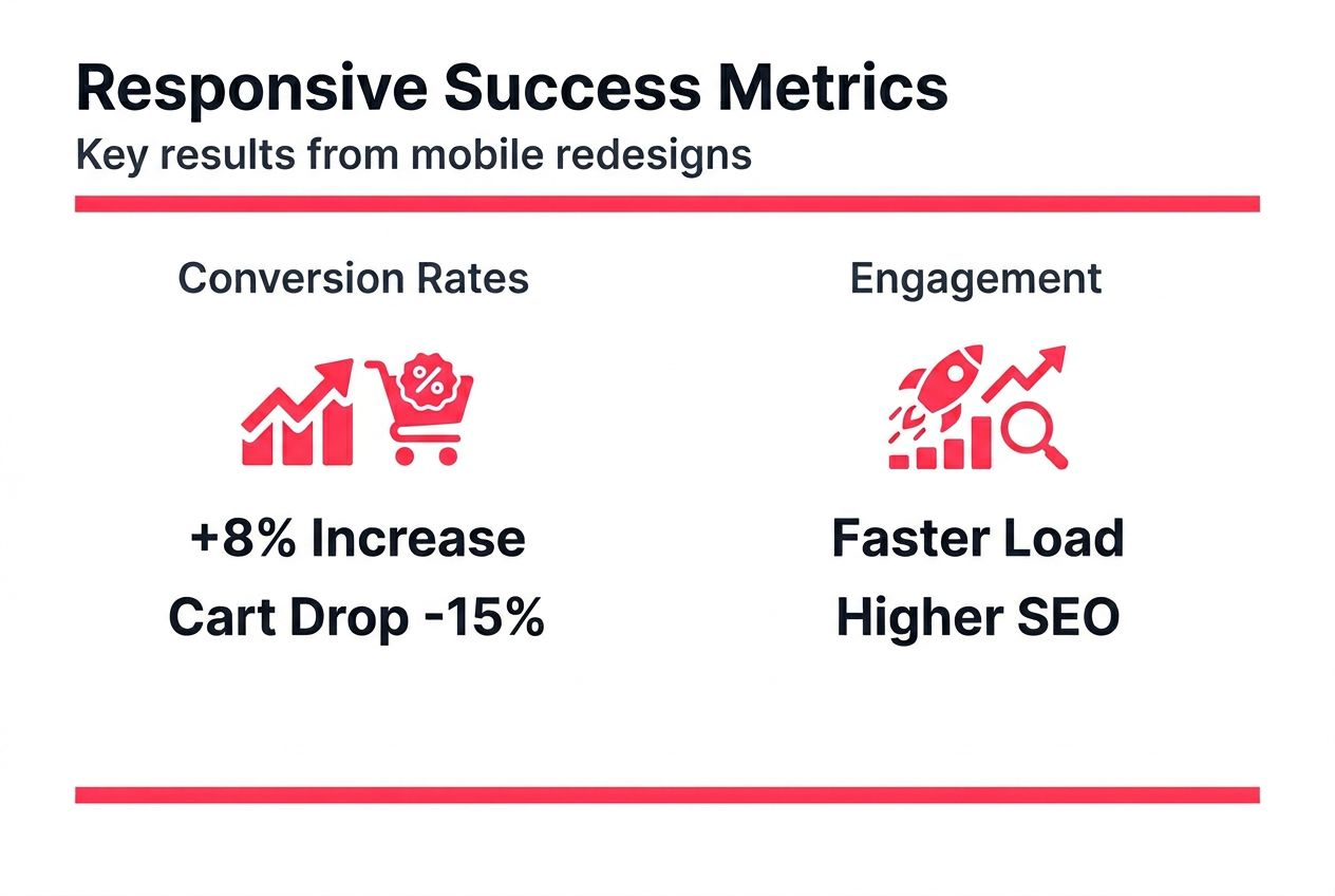
Conversion rate improvements typically range from 5-8% after responsive redesign launches. Stores with particularly poor initial mobile experiences sometimes see double-digit gains. These improvements compound over time as better mobile experiences improve brand perception and encourage repeat purchases.
Cart abandonment on mobile typically reduces by 10-20% when checkout flows are properly optimised for mobile devices. This metric often shows improvement within the first month post-launch, making it a useful early success indicator.
Pro Tip: Establish comprehensive baseline metrics across mobile traffic, engagement, and conversion before starting your redesign. Track these same metrics weekly for the first 3 months post-launch to quantify ROI and identify any issues requiring adjustment.
Key performance indicators to monitor include:
- Mobile conversion rate compared to desktop
- Mobile revenue percentage of total sales
- Average mobile session duration
- Mobile bounce rate and exit rate
- Cart abandonment rate on mobile
- Core Web Vitals scores (LCP, FID, CLS)
- Mobile organic search traffic and rankings
- Customer satisfaction scores segmented by device
SEO improvements manifest gradually over several months as Google re-crawls and re-indexes your improved mobile site. Expect to see initial ranking improvements within 4-8 weeks, with continued gains over the following months. Mobile-first indexing compliance typically produces the strongest SEO benefits for sites that previously had poor mobile experiences.
For project planning guidance, review ecommerce project timelines and costs. Additional context on responsive redesign timelines and costs helps with budget planning.
Discover professional mobile responsive ecommerce design services
Transforming your ecommerce store into a mobile-optimised powerhouse requires specialist expertise across UX design, frontend development, and performance optimisation. Professional support accelerates your project timeline while ensuring best practices throughout implementation.
Big Eye Deers specialises in building high-performing responsive ecommerce platforms for UK retail brands. Our team delivers mobile-first design across both Magento web design services and Shopify ecommerce agency solutions. We use Figma to plan responsive user journeys and wireframe mobile-optimised interfaces before development begins, ensuring efficient delivery and clear decision-making throughout the project.

Our approach combines UX-led design with performance optimisation and ongoing support. We implement Klaviyo for lifecycle marketing and Klevu for enhanced mobile product discovery. Security and compliance are built in from the start, with proactive monitoring and PCI compliance protection. Meet the team at Big Eye Deers to discuss how we can transform your mobile ecommerce performance.
FAQ
What is mobile responsive web design?
Mobile responsive web design is a development approach ensuring websites adapt fluidly across all device screen sizes, prioritising mobile usability. It uses flexible layouts, images, and CSS media queries to create seamless experiences on smartphones, tablets, and desktops without requiring separate mobile sites.
How long does it take to redesign an ecommerce site responsively?
Responsive ecommerce redesigns typically require 3-6 months depending on site complexity, catalogue size, and custom functionality requirements. This timeline includes research, UX design, development, integration, and comprehensive device testing phases.
What common mistakes should I avoid in mobile responsive design?
Avoid using touch targets smaller than 48×48 device-independent pixels, which cause frequent misclicks and user frustration. Never serve unoptimised desktop images to mobile devices as this destroys page speed. Don’t rely on fixed breakpoints when container queries provide superior flexibility across diverse modern devices.
How does mobile responsive design affect SEO?
Google’s mobile-first indexing exclusively uses the mobile version of websites for crawling and ranking decisions. Responsive sites with optimised mobile experiences receive preferential treatment in search results. Poor mobile usability directly harms rankings and can result in de-indexing for severely non-compliant sites.
Recommended


Adobe Commerce (Magento)
Formerly known as Magento, Adobe Commerce is built for complex catalogues, integrations, and long term growth. We design and develop stable, scalable stores that support demanding eCommerce requirements, including multi-store setups, complex pricing, and Hyva based performance improvements.

Bespoke Build
We design and build custom eCommerce platforms for businesses with complex workflows, integrations, or non standard requirements. Built from scratch around your business needs using Laravel and modern architectures.

Working with brands across the UK from our offices in Cardiff and Exeter, you deal directly with a senior team of designers and developers specialising in Shopify, Magento, WordPress and bespoke eCommerce platforms.
We focus on commercial outcomes. Better conversion rates, strong SEO foundations and eCommerce platforms that continue to improve long after launch.