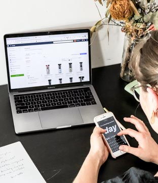
Horizontal Lists for Mobile
Horizontal lists on mobile websites have become the norm nowadays. If you go on a ecommerce websites or even Netflix, you will probably see that horizontal lists or scrolling is present on the website.
But wait… What are these Horizontal lists you speak of?!
Well, they are exactly that. A list that scrolls horizontally! But rather than a list of words or small text, imagine products or images side by side and you can scroll across.
These lists are great because they save space on webpages. If you have a lot of categories and a lot of products, then horizontal scrolling lists helps separate them. So you can see why they are quite a popular function to have on mobile websites.
HOWEVER, while they are a great addition to any mobile website design, you need to understand how to use and design them, because with everything, there is always a good way and a bay way!
When to Use Horizontal Lists
Horizontal lists work best when you have a lot of categories and products that you need to separate. If you are an e-commerce store and have a lot of products, then horizontal scrolling could work really well.
A great example of this would be websites such as Netflix or Amazon Prime. If you use the App for either one, you will notice they use a lot of horizontal scrolling that separates different categories, such as TV, Films, and then different genres.
This is great as you can scroll vertically to see what categories they have and then the horizontal scrolling list allows you to see what product is in each category, without taking up too much space.
So you can see for a company that has a lot of categories and products to show, a horizontal scrolling list is a great function to have. If however you are a website that is more information or lead generating, then a horizontal list may not work for you!
When NOT to use Horizontal Lists
While horizontal scrolling lists are great for mobile, we would advise against using them too much for desktop. The reason for this is because the way people use desktop is completely different to how they would use mobile or tablets. With desktop, people have a mouse to work with, while handheld devices are touch screen.
Desktop browsers also have more space for people to work with, so a horizontal list may not be needed in the first place. A horizontal list may work for places such as the homepage to give visitors a brief preview of what they can find. But throughout the rest of the site, a horizontal list is usually not needed.
Designing Horizontal Lists
If you do plan to use horizontal lists, you need to make sure you design them right. Here are a few tips on how best to design horizontal lists.
- Use visual indicators: with handheld devices, the majority of people will scroll vertically. So if you include horizontal lists you need to make sure you have visual indicators that the lists are horizontal and you can scroll through them. These indicators could be little arrows either side of the list, a scroll bar under it or even a “peek” of the next item, showing there is more content if they keep scrolling.
- Add a “View More” button: this is best practice and gives the visitor the option to see more within a category while staying on the page. When clicking on the “see more” button, the list should then open up into a grid view. Of course if you include this, also include a “view less” button, so visitors know they can close the grid.
- Adapt the list for tablets: while a scrolling list is great for a mobile device, it may not be the best option for a tablet. Tablet have bigger screens than mobiles, so a continuous scrolling list could look off on a tablet. We would probably say a static horizontal list works better with a “view more” button as well. It will look cleaner and if the visitor is interested, they will click on the “view more” button anyway.
So, in all, horizontal lists are a fab function for any mobile or handheld device. Just make sure you are using them because they will enhance your website’s UX and not just because they are the “in” design trend.
If you want to see how horizontal lists could work for your mobile website, why not come and talk to us and see how we can incorporate them into your website. You can contact us here.


Adobe Commerce (Magento)
Formerly known as Magento, Adobe Commerce is built for complex catalogues, integrations, and long term growth. We design and develop stable, scalable stores that support demanding eCommerce requirements, including multi-store setups, complex pricing, and Hyva based performance improvements.

Bespoke Build
We design and build custom eCommerce platforms for businesses with complex workflows, integrations, or non standard requirements. Built from scratch around your business needs using Laravel and modern architectures.

Working with brands across the UK from our offices in Cardiff and Exeter, you deal directly with a senior team of designers and developers specialising in Shopify, Magento, WordPress and bespoke eCommerce platforms.
We focus on commercial outcomes. Better conversion rates, strong SEO foundations and eCommerce platforms that continue to improve long after launch.