Responsive Design and Ecommerce – Boosting Store Performance

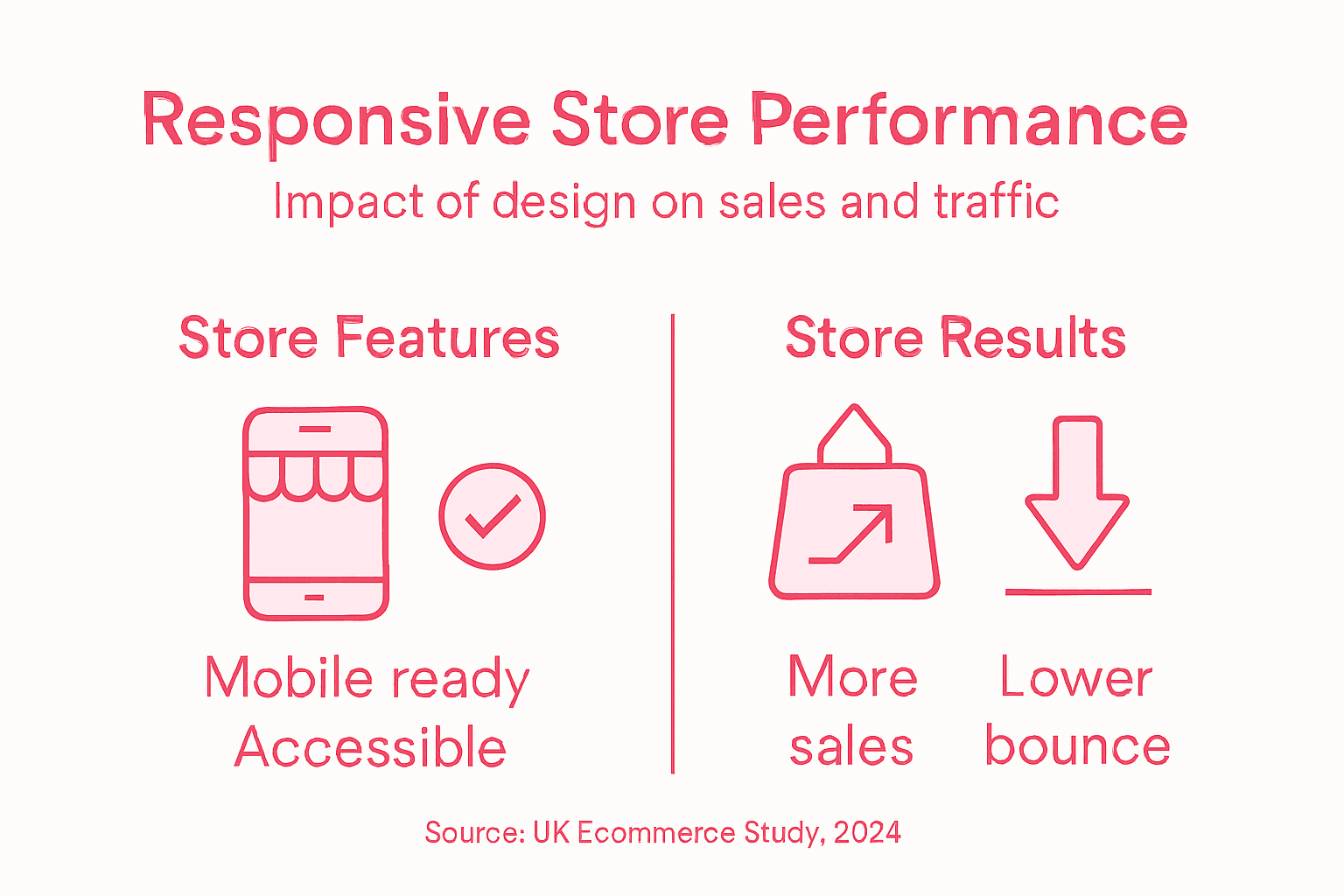
Every Ecommerce Manager knows the frustration when customers struggle to shop on their mobile or tablet. With over 60 percent of ecommerce traffic coming from mobile devices, a non-responsive store is risking lost sales and damaged trust. Responsive design means your Magento or Shopify site adapts seamlessly for all users, offering a consistent, satisfying experience that drives conversions. Discover how embracing this design approach helps your store stand out in the competitive British retail market.
Table of Contents
- Responsive Design – Definition And Core Concepts
- How Responsive Design Enhances Ecommerce Ux
- Key Features For High-Performing Online Stores
- Risks Of Ignoring Mobile And Accessibility
- Comparing Alternatives: Adaptive And Mobile-First
Key Takeaways
| Point | Details |
|---|---|
| Responsive Design is Essential | A responsive layout ensures a seamless experience across all devices, crucial for retaining customers and maintaining sales. |
| Impact on SEO and Trust | Google favours mobile-friendly websites, meaning responsiveness can directly affect your search ranking and customer trust. |
| User-Centric Approach | Understanding user behaviour on different devices and adopting a mobile-first strategy enhances the overall shopping experience. |
| Risks of Non-Responsiveness | Ignoring mobile and accessibility leads to lost sales, reputational damage, and may even invite legal consequences. |
Responsive design – definition and core concepts
Responsive design is a design approach that makes websites and applications work well across all devices and screen sizes. Rather than creating separate versions for mobile, tablet, and desktop, responsive design adapts a single website to fit any device seamlessly.
At its core, responsive design means your ecommerce store automatically adjusts its layout, images, and content based on the device viewing it. A customer browsing your Magento or Shopify store on their phone sees an optimised mobile experience, whilst the same store looks perfect on a desktop monitor.
The fundamental principle is this: design that adapts across different browsers and devices ensures your store reaches every potential customer, regardless of how they access it.
Why this matters for your store
Over 60% of ecommerce traffic now comes from mobile devices. If your store isn’t responsive, half your customers face a frustrating, clunky experience that pushes them elsewhere. That’s not just lost sales—it’s lost trust.
Responsive design also affects your search rankings. Google prioritises mobile-friendly sites, meaning a non-responsive store gets buried in search results.
Core concepts you need to understand
Responsive design relies on a few key technical and design principles:
- Fluid grids: Content scales proportionally rather than staying fixed at specific pixel widths
- Flexible images: Photos and graphics resize to fit their containers without breaking layouts
- Media queries: CSS rules that apply different styles based on screen size, orientation, and device capabilities
- Mobile-first approach: Building for small screens first, then enhancing for larger ones
- Touch-friendly interfaces: Buttons and interactive elements sized for fingers, not just mouse clicks
A responsive store converts better, ranks higher in search, and keeps customers happy across all devices—it’s not optional anymore for competitive ecommerce brands.
Understanding context and user needs
Responsive design isn’t just about squeezing content onto smaller screens. It’s about understanding how customers actually use your store on different devices. Someone browsing on their commute needs fast-loading pages and simple navigation. A customer at home on a desktop might explore more detailed product information.
Designing with user behaviour in mind means adjusting not just layout, but the entire experience for each context.
This is where the design process matters. Discovery, defining what your customers need, then developing and refining the solution ensures your responsive design actually works for real people.
Pro tip: Start mobile-first when redesigning your store—this forces you to prioritise what truly matters and creates a better experience for all users, not just mobile visitors.
How responsive design enhances ecommerce UX
Responsive design directly impacts how customers feel when shopping on your store. When your Magento or Shopify site adapts seamlessly to any device, customers get a frictionless experience that keeps them engaged and ready to buy.

The connection is straightforward: a responsive store removes obstacles. Instead of pinching, zooming, and hunting for buttons on a tiny screen, customers navigate naturally. This reduces frustration and builds confidence in your brand.
Making interfaces work for everyone
Accessible and usable interfaces across devices mean more customers can complete purchases. This includes people using older phones, slower connections, or assistive technologies. A responsive design accommodates all of them.
When content is perceivable and operable regardless of device, you’re not just improving UX—you’re expanding your customer base. That’s better business.
Reducing friction at every step
Customers abandon carts when checkout feels clunky. Responsive design prevents this by ensuring:
- Product images display clearly on all screen sizes
- Forms and input fields are touch-friendly and easy to complete
- Navigation menus collapse logically on mobile rather than overwhelming the screen
- Payment pages load quickly and remain secure across devices
- Search and filtering work smoothly whether browsing on phone or desktop
Responsive design reduces the cognitive load and operational complexity that frustrate shoppers—simpler interactions mean higher conversion rates.
Building trust through consistency
When your store looks polished on every device, customers perceive quality. A site that works well on mobile signals professionalism, especially to customers who primarily shop via smartphone.
Consistency also matters. Customers expect to find the same products, prices, and information across devices. Responsive design ensures they do.
Summary of business impacts of key responsive design features:
| Responsive Feature | Impact on Store Performance | Effect on Customer Experience |
|---|---|---|
| Fluid layouts | Optimised for all screen sizes | Seamless browsing |
| Mobile-optimised checkout | Reduces abandonment, faster sales | Simple, stress-free payment |
| Accessible navigation | Increases retention, search ranking | Easier product discovery |
| Consistent branding | Builds trust, repeat purchases | Professional and reliable image |
User behaviour drives better design
Optimising store UX for higher conversions starts by understanding how customers actually shop. Someone on mobile during lunch might browse quickly. Someone on desktop at home might dive deep into product details.
Responsive design accommodates both behaviours. You’re not just shrinking desktop layouts—you’re redesigning for context and intent.
Pro tip: Test your store on real devices and real networks—not just browser emulators—to catch responsive design issues that impact actual customers.
Key features for high-performing online stores
High-performing ecommerce stores share common technical and design features that drive conversions and customer satisfaction. These aren’t luxuries—they’re fundamental requirements for competing in today’s retail landscape.
Your Magento or Shopify store needs to do more than look good. It needs to function reliably, process payments securely, and build customer trust at every interaction.
Essential functional features
A responsive store is just the foundation. Beyond that, high-performing stores require:
- Fast load times: Pages that load in under 3 seconds across all devices and connections
- Secure payment processing: PCI-compliant systems that protect customer financial data
- Accurate product information: Clear descriptions, pricing, and stock levels updated in real time
- Intuitive search and navigation: Customers find what they need within seconds
- Mobile-optimised checkout: Minimal steps, guest checkout options, multiple payment methods
- Customer accounts: Order history, saved addresses, and personalisation features
High-performing stores combine technical reliability with human-centred design—speed matters, but so does clarity and trustworthiness.
Building customer confidence
Transparent seller details and clear pricing information aren’t just legal requirements—they’re conversion drivers. Customers shop with confidence when they know who you are and what they’re paying.
This means displaying your company information prominently, showing delivery costs upfront, and explaining your returns policy clearly. No surprises at checkout.
Backend systems that scale
Customers see the front end. Behind the scenes, your store needs robust infrastructure for inventory management, order processing, and reporting. As your business grows, these systems need to keep pace without breaking.
Seamless integration between your store, payment gateways, and accounting systems eliminates manual work and reduces errors that frustrate customers.
Design features that convert
Essential ecommerce website features include visual consistency, readable typography, and strategic use of imagery. Your store should feel professional and unified across every page.
Product pages need high-quality images from multiple angles, clear size guides, and customer reviews. Category pages need effective filtering and sorting. Every page serves a purpose.
Performance monitoring and optimisation
High-performing stores aren’t static. They’re continuously monitored and refined based on customer behaviour. You need analytics that show where customers drop off, which products convert best, and how different devices perform.
This data drives decisions about layout changes, feature additions, and performance improvements.
Pro tip: Audit your store quarterly against competitor sites and current design standards—what worked last year might be costing you sales today.
Risks of ignoring mobile and accessibility
Ignoring mobile responsiveness and accessibility isn’t just a design oversight—it’s a business risk that directly impacts your bottom line. Retailers who skip these foundations lose customers, damage their reputation, and expose themselves to legal liability.
The numbers tell the story. Over 20% of the UK population experiences some form of disability or temporary impairment. Mobile traffic accounts for more than 60% of ecommerce visits. Ignore either, and you’re shutting out a massive portion of your potential market.
Lost sales and reduced traffic
Customers abandon non-responsive sites instantly. A store that doesn’t work on mobile doesn’t get mobile traffic. That’s revenue walking straight to your competitors.
Poor mobile responsiveness and accessibility issues directly reduce user engagement and conversion rates. Government monitoring revealed nearly all tested websites showed serious accessibility problems. Your store likely does too unless you’ve deliberately addressed it.
Excluding customers with disabilities
Accessibility barriers aren’t minor inconveniences. They’re complete blockers for people with visual impairments, hearing loss, motor disabilities, or cognitive differences.
These customers can’t use your store if you haven’t implemented:
- Keyboard navigation for users who can’t use a mouse
- Alternative text for images that screen readers can interpret
- Sufficient colour contrast for people with low vision
- Captions and transcripts for video content
- Clear, simple language that’s easy to understand
Accessibility isn’t an afterthought—it’s the difference between a customer who can buy from you and one who simply cannot.
Legal and regulatory consequences
Accessibility requirements for websites and applications apply across the UK, including ecommerce sites. Non-compliance can trigger legal action, fines, and enforcement action from the Equality and Human Rights Commission.
Even without legal enforcement, accessibility complaints damage your brand. Social media spreads fast when customers feel excluded.
Reputational harm
A store that doesn’t work properly reflects poorly on your entire brand. Customers assume if your digital presence is neglected, your products and service are too.
Conversely, an accessible, responsive store signals professionalism and customer care. That builds loyalty and word-of-mouth referrals.
Performance and conversion impact
Accessibility-first design often improves performance for everyone. Faster load times, clearer navigation, and simpler checkout processes benefit all users. When your store works well for people with disabilities, it works better for everyone.
Pro tip: Test your store with real assistive technology tools like screen readers—not just automated accessibility checkers—to catch real-world barriers.
Comparing alternatives: adaptive and mobile-first
Responsive design isn’t the only approach to building multi-device stores. Adaptive design and mobile-first design offer different strategies, each with distinct trade-offs. Understanding which suits your business is crucial.
For most UK ecommerce brands, responsive design remains the best choice. But it’s worth understanding the alternatives and why responsive typically wins.
Here is a comparison of design approaches for ecommerce websites:
| Approach | Maintenance Workload | User Experience | Cost Impact |
|---|---|---|---|
| Responsive Design | Single codebase, easy | Consistent across all devices | Lower initial and ongoing |
| Adaptive Design | Multiple versions, high | Tailored layouts, less flexible | Much higher development cost |
| Mobile-First | Progressive, single base | Prioritises mobile engagement | Efficient, improves loyalty |
What is adaptive design?
Adaptive design creates separate layouts tailored to specific device sizes. Rather than one flexible layout, you build distinct versions for mobile, tablet, and desktop. Each gets optimised for its screen dimensions.
This sounds attractive in theory. But it creates significant practical problems:
- Multiple versions to maintain: Code, content, and design exist in separate branches, multiplying your workload
- Increased development cost: Building three versions instead of one costs considerably more upfront and ongoing
- Synchronisation challenges: Keeping content consistent across versions becomes a nightmare as your store evolves
- Higher complexity: Any feature change requires updates across all versions
- Slower deployment: Changes take longer because you’re managing multiple codebases
Adaptive design offers pixel-perfect control but at the cost of complexity, expense, and maintenance headaches that compound over time.
The mobile-first approach
Mobile-first design prioritises mobile devices before scaling up for larger screens. You start designing for the smallest screen, then progressively enhance for tablets and desktops.
This forces discipline. You prioritise ruthlessly—what truly matters on a phone? Only then do you add refinements for larger screens.
Mobile-first is a methodology within responsive design, not a separate approach. Your final store still uses one responsive codebase that adapts fluidly.
Why responsive design wins for ecommerce
Responsive design offers the best balance for most retailers:
- Single codebase: One version to build, maintain, and update
- Flexible and future-proof: Works across all current and future devices without redesign
- Consistent experience: Same content, features, and branding everywhere
- Lower cost: Significantly cheaper than building multiple versions
- Search engine friendly: Mobile-first indexing favours single, responsive sites for search rankings
- Faster iterations: Deploy changes once, benefiting all users immediately
Adaptive design might seem appealing when targeting very specific devices, but the maintenance burden grows quickly as you scale.
When mobile-first matters most
Mobile-first methodology is increasingly essential. As mobile traffic dominates—often 60%+ of ecommerce visits—designing for mobile first ensures your store performs brilliantly where it matters most.
This doesn’t mean abandoning desktop users. It means prioritising mobile constraints upfront, which paradoxically improves the entire experience.
Pro tip: If your analytics show 70% mobile traffic, build mobile-first but test ruthlessly on desktop to ensure nothing breaks when the layout expands.
Transform Your Ecommerce Store with Expert Responsive Design
If you recognise the challenges of delivering a seamless shopping experience across all devices as described in the article, Big Eye Deers offers the specialist solutions your store needs. From tackling the complexities of fluid grids and flexible images to mastering mobile-first approaches that boost conversions, our expert team combines deep Magento and Shopify knowledge with proven UX and performance strategies to elevate your online store.

Don’t lose customers to clunky mobile experiences or outdated design methods. Act now to unlock a secure, fast, and highly responsive store that aligns perfectly with your customers’ behaviours and expectations. Visit Big Eye Deers today to discover how our tailored Magento and Shopify builds can deliver results. Explore how we support top ecommerce features including lifecycle marketing and onsite product discovery to keep your store future-proof. Ready to boost your store performance now Visit https://bigeyedeers.co.uk and start your transformation.
Frequently Asked Questions
What is responsive design in ecommerce?
Responsive design is an approach that ensures websites and applications function well across various devices and screen sizes. It allows a single website to adapt its layout, images, and content automatically based on the device being used for browsing.
Why is responsive design important for my ecommerce store?
Responsive design is crucial because over 60% of ecommerce traffic comes from mobile devices. A responsive site enhances user experience, reduces frustration, and improves search engine rankings, as Google prioritises mobile-friendly websites.
How does responsive design affect user experience (UX)?
Responsive design significantly enhances user experience by providing a seamless browsing experience across all devices. It removes obstacles like pinching or zooming, allowing customers to navigate easily, leading to increased engagement and higher conversion rates.
What are the key principles of responsive design?
The key principles of responsive design include fluid grids that resize content proportionally, flexible images that adapt without breaking layouts, media queries that apply different styles based on device capabilities, a mobile-first approach prioritising small screens, and touch-friendly interfaces for easier navigation.
Recommended


Adobe Commerce (Magento)
Formerly known as Magento, Adobe Commerce is built for complex catalogues, integrations, and long term growth. We design and develop stable, scalable stores that support demanding eCommerce requirements, including multi-store setups, complex pricing, and Hyva based performance improvements.

Bespoke Build
We design and build custom eCommerce platforms for businesses with complex workflows, integrations, or non standard requirements. Built from scratch around your business needs using Laravel and modern architectures.

Working with brands across the UK from our offices in Cardiff and Exeter, you deal directly with a senior team of designers and developers specialising in Shopify, Magento, WordPress and bespoke eCommerce platforms.
We focus on commercial outcomes. Better conversion rates, strong SEO foundations and eCommerce platforms that continue to improve long after launch.