Supa-redesign for Bathroom Supastore
When our lovely clients at Bathroom Supastore came to us looking for a Homepage refresh, we were definitely up for the task.
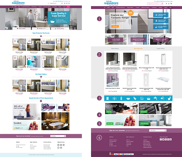
Having designed the original homepage, we needed to try and look at the page objectively, and see where we could improve user experience and get more interaction from the customers. Below is a side-by-side comparison of the sites.
For the new homepage, we changed the below:
- Created a grid style area – we redesigned the top part of the page to feature a grid style as opposed to the original where they all featured on the banner. This helped clean up the page and allowed more opportunities for CTAs at this level.
- Merged ‘Best Sellers’, ‘New Products’, and ‘Latest Offer’ – the previous homepage featured the products in a carousel layout, which are rarely used and receive less interaction as visitors normally miss products past the first four. By merging them together, this allowed for more products to show on the top level. By giving customers the option to switch also increases level of interaction, which helps to keep them engaged and see more of the products on offer.
- Added category icons – these were added to the page to offer another way for users to see all categories on offer. The icons have a hover functionality where the name of the category will show, this is another way to help get users engaged, while the use of icons gives a more consumer friendly feel.
- Changed the CTA grid – as you can from the previous homepage design, the blocks were different sizes. We cleaned this up by changing the grid to a 2×2 grid with a clear message and buttons from users to click through.
- Added different coloured CTA buttons – we changed a few of the CTAs to orange and green. The change of colour makes them stand out in comparison to the brand’s purple and blue colour.
- Updated footer – we changed the colour of the footer to purple to help introduce a hierarchy to the page. The change of colour from white also helps the footer stand out, making it look more contemporary and helping the links for well used static pages become more prominent.
Overall, we love the new homepage design for Bathroom Supastore. In comparison to the previous homepage, it’s cleaner but has more interactive features, which will help keep users engaged. We particularly like the different coloured CTAs as it adds a little contrast to the page, while also standing out to help increase interaction.
Why not check out their brand new homepage by visiting their site HERE.


Adobe Commerce (Magento)
Formerly known as Magento, Adobe Commerce is built for complex catalogues, integrations, and long term growth. We design and develop stable, scalable stores that support demanding eCommerce requirements, including multi-store setups, complex pricing, and Hyva based performance improvements.

Bespoke Build
We design and build custom eCommerce platforms for businesses with complex workflows, integrations, or non standard requirements. Built from scratch around your business needs using Laravel and modern architectures.

Working with brands across the UK from our offices in Cardiff and Exeter, you deal directly with a senior team of designers and developers specialising in Shopify, Magento, WordPress and bespoke eCommerce platforms.
We focus on commercial outcomes. Better conversion rates, strong SEO foundations and eCommerce platforms that continue to improve long after launch.