User-friendly navigation guide for ecommerce stores
TL;DR:
- Most navigation issues stem from having too many menu links that frustrate users.
- Limiting primary menu items to five or seven with clear labels improves website usability and conversions.
User-friendly navigation is the design of website menus and pathways that allow visitors to find key pages and products without friction or confusion. 94% of users identify easy navigation as the single most useful feature of a website. That figure alone tells you everything about where to focus your design effort. Poor navigation drives bounce rates up and conversions down. This guide gives website designers and ecommerce managers the principles, techniques, and practical fixes needed to build intuitive navigation systems that keep customers moving towards the checkout.
What makes navigation user-friendly? Key principles and best practices
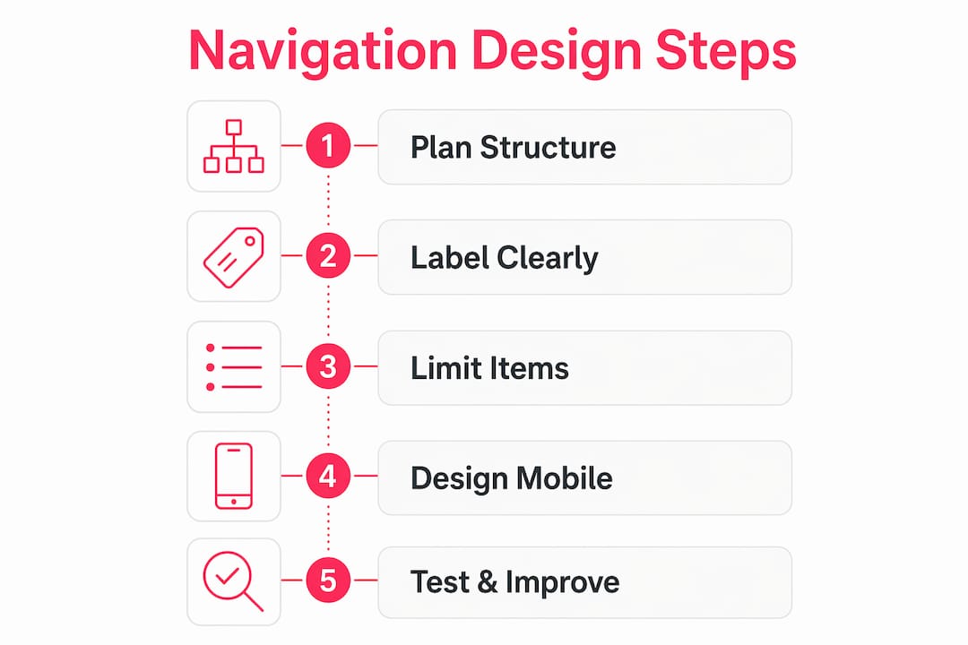
User-friendly navigation rests on four principles: simplicity, clarity, consistency, and appropriate structure. Get these right and your customers will find what they need without thinking twice about it.

The most common mistake is cramming too many links into the primary menu. Limiting top-level items to 5–7 reduces cognitive load and keeps users focused on the most important destinations. Every extra link beyond that threshold competes for attention and dilutes the value of the links that matter most.
Label clarity is equally critical. Plain labels like “Products” outperform creative terms like “Our Playground” every time. Designers often err by prioritising cleverness over clarity, and that choice costs real conversions. Your customers are not trying to decode your brand personality through menu text. They want to find the thing they came for.
Consistency across pages is non-negotiable. If your navigation changes structure or position between the homepage and a product page, users lose their bearings. A consistent user-friendly site layout builds confidence and reduces the mental effort required to move through your store.
Key principles to apply from day one:
- Keep primary menu items to 5–7 maximum
- Use plain, descriptive labels that match what customers already call things
- Maintain the same navigation structure on every page
- Apply visual hierarchy: make the most important links visually prominent
- Avoid dropdown menus with more than two levels of depth
- Never bury your most visited pages behind multiple clicks
Pro Tip: Run a five-second test with someone unfamiliar with your store. If they cannot name the top three things your site sells after five seconds on the homepage, your navigation labels need rethinking.
How to design effective mobile navigation for ecommerce
Mobile navigation is a triage process. You select the essential destinations for immediate, visible access and move everything else into secondary menus or drawers. This is not a compromise. It is the correct approach for the way mobile users actually behave.
Mobile tap targets must be at least 44px by 44px to prevent accidental taps and meet accessibility standards. Test on real devices, not just browser emulators. Emulators do not replicate the imprecision of a thumb on a glass screen.
Bottom navigation bars with more than 5 items reduce usability significantly. Limit your mobile primary navigation to 3–5 destinations. Use a secondary drawer or hamburger menu for the remainder. This keeps the primary experience clean without hiding content that some customers genuinely need.
Sticky menus are worth the implementation effort on mobile. When a customer scrolls deep into a product page or category listing, a persistent navigation bar means they never have to scroll back to the top to move on. Visible icons alongside text labels also reduce ambiguity, particularly for international customers or those with lower literacy levels.
Mobile navigation best practices:
- Minimum 44px tap targets on all interactive elements
- Limit primary mobile nav to 3–5 items
- Use hamburger or bottom navigation bars for secondary pages
- Implement sticky menus for long-scroll pages
- Test on physical devices across iOS and Android
- Apply accessible navigation design: sufficient colour contrast, focus states, and ARIA labels
Pro Tip: Check your mobile responsive design by completing a full purchase journey on your phone with one hand. If you struggle at any point, your mobile navigation has a problem.
How to structure and label navigation intuitively
The biggest structural error in ecommerce navigation is organising menus around how the company thinks about its products rather than how customers search for them. Your internal catalogue structure and your customer’s mental model are rarely the same thing.
Logical grouping solves this. Related products and features belong together in the same category, even if they sit in different departments internally. A customer looking for “outdoor furniture” does not care whether your business separates garden chairs from garden tables across two different buying teams.
Use breadcrumbs throughout your store. Breadcrumbs show customers exactly where they are within your site hierarchy and give them a one-click route back to any parent category. They are particularly valuable on deep catalogue sites with multiple levels of subcategory. The path to purchase becomes far clearer when customers always know their location.
Progressive disclosure is another underused technique. Show customers the top-level categories first, then reveal subcategories only when they select a parent. This prevents the visual overload that comes from displaying every option at once.
Steps to structure navigation around user mental models:
- Conduct card sorting with real customers to discover how they group your products naturally
- Map the results against your current navigation structure and identify gaps
- Rename any category that uses internal jargon or branded terminology
- Group related products and features together regardless of internal department structure
- Add breadcrumbs to every category and product page
- Apply progressive disclosure for catalogues with more than three levels of depth
| Navigation element | Purpose | Common mistake |
|---|---|---|
| Top-level menu | Primary wayfinding | Too many items, jargon labels |
| Breadcrumbs | Location context | Missing on product pages |
| Subcategory menus | Deeper discovery | Overloaded with options |
| Search bar | Secondary support | Used to compensate for poor nav |
| Footer navigation | Utility links | Duplicates primary nav unnecessarily |
Search functions support discovery but must not replace poor navigation or a flawed site architecture. If your analytics show that a large proportion of visitors go straight to search, that is a signal your navigation is failing them, not a sign that search is working well.
Common navigation challenges and how to fix them
Navigation problems tend to cluster around the same handful of issues. Identifying them early saves significant rework later.
The most frequent problems and their fixes:
- Too many links: Audit your primary menu and cut anything that does not represent a top-five customer destination. Move the rest to the footer or a secondary menu.
- Overuse of dropdowns: Mega-menus with dozens of options create decision paralysis. Limit dropdown columns to three and rows to five per column.
- No active state indicators: Customers need to know which page they are on. Active page indicators and sticky menus maintain user orientation and reduce disorientation on large sites.
- Heavy JavaScript menus: CSS micro-interactions are preferred over JavaScript-heavy menus for performance. Slow menus frustrate users and damage Core Web Vitals scores.
- Inconsistent mobile adaptation: A desktop navigation that collapses into an unusable mobile menu is one of the most common ecommerce web design mistakes we see.
Testing is the fastest route to improvement. Run session recordings to watch where customers hesitate or backtrack. Check your analytics for pages with high exit rates that are not checkout pages. Those exits often point to navigation dead ends. Combine quantitative data with qualitative feedback from real customers to get the full picture.
Pro Tip: Set up a heatmap on your main navigation bar for two weeks. The links that receive almost no clicks are candidates for removal or relocation, freeing up visual space for the links that actually drive revenue.
UX improvements for retail stores consistently show that fixing navigation problems produces faster conversion gains than almost any other design change. Navigation is the foundation. Everything else builds on top of it.
Key takeaways
Effective ecommerce navigation requires limiting menu items, using plain labels, designing for mobile first, and testing with real customers to remove friction at every step.
| Point | Details |
|---|---|
| Limit primary menu items | Keep top-level navigation to 5–7 items to reduce cognitive load and improve focus. |
| Use plain, descriptive labels | Replace clever or branded terms with words customers already use to find products. |
| Design mobile navigation as triage | Restrict mobile primary nav to 3–5 items and move secondary pages to drawers. |
| Apply breadcrumbs and active states | Show customers their location at all times to reduce disorientation and backtracking. |
| Test with real users and real data | Use session recordings and heatmaps to identify navigation failures before they cost conversions. |
Navigation design: what 17 years of ecommerce builds has taught me
The thing that surprises most clients when we start a navigation audit is how rarely the problem is a lack of links. Almost always, the problem is too many. Teams add links over time because every department wants visibility, and nobody ever removes anything. The result is a primary menu that tries to do everything and ends up doing nothing well.
What I have found genuinely effective is treating navigation like a serial position list. Crucial CTA links placed at the start or end of a menu capture the most attention because users remember the first and last items best. That is not a design opinion. It is how human memory works. Put your highest-value destination first and your second-highest last. Everything else fills the middle.
The mobile-first imperative is not a trend. It is the permanent reality of ecommerce. If you design desktop navigation first and then try to adapt it for mobile, you will always end up with a compromised mobile experience. Start with the 3–5 things a mobile customer needs most urgently, build that experience properly, and then expand for desktop. The discipline of mobile-first forces you to make the hard decisions about what actually matters.
Navigation is not a static UI element. It is a wayfinding system that needs to evolve as your catalogue, your customers, and your business change. Review it at least twice a year. Treat it as infrastructure, not decoration.
— Steve
How Bigeyedeers builds navigation that converts
Bigeyedeers has spent over 17 years designing and building ecommerce stores on Magento and Shopify for growing and enterprise retail brands across the UK. Navigation design is central to every project we take on, planned in Figma before a single line of code is written.

Whether you are building a new store or fixing an existing one, our team works through user journeys, information architecture, and mobile usability to create navigation that genuinely serves your customers. We handle everything from Magento web design to full Shopify builds, with UX and performance built in from the start. If your current navigation is costing you conversions, we would be glad to take a look.
FAQ
What is user-friendly navigation?
User-friendly navigation is the design of website menus and pathways that allow visitors to find pages and products quickly, without confusion or unnecessary clicks. It combines clear labels, logical structure, and consistent placement across all pages.
How many items should a navigation menu have?
Primary navigation menus should contain 5–7 items. Keeping within this range reduces cognitive load and helps users focus on the most important destinations without feeling overwhelmed by choice.
What size should mobile navigation tap targets be?
Mobile tap targets should be at least 44px by 44px, as specified by accessibility standards. This size prevents accidental taps and makes navigation usable for customers with limited dexterity.
Why is search not a substitute for good navigation?
Heavy reliance on site search indicates that navigation and information architecture are failing users. Search supports discovery but cannot compensate for a poorly structured menu or unclear category labels.
How do I test whether my navigation is working?
Use session recordings, heatmaps, and exit-rate data to identify where customers hesitate or leave. Combine this with card sorting or five-second tests with real users to validate whether your labels and structure match customer expectations.
Recommended


Adobe Commerce (Magento)
Formerly known as Magento, Adobe Commerce is built for complex catalogues, integrations, and long term growth. We design and develop stable, scalable stores that support demanding eCommerce requirements, including multi-store setups, complex pricing, and Hyva based performance improvements.

Bespoke Build
We design and build custom eCommerce platforms for businesses with complex workflows, integrations, or non standard requirements. Built from scratch around your business needs using Laravel and modern architectures.

Working with brands across the UK from our offices in Cardiff and Exeter, you deal directly with a senior team of designers and developers specialising in Shopify, Magento, WordPress and bespoke eCommerce platforms.
We focus on commercial outcomes. Better conversion rates, strong SEO foundations and eCommerce platforms that continue to improve long after launch.