What is checkout optimisation and why does it matter?
TL;DR:
- Checkout optimisation improves the ecommerce checkout process to boost conversions by reducing friction.
- It involves fixing usability issues, streamlining flow steps, and implementing best UX practices for better results.
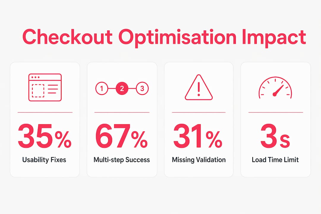
Checkout optimisation is the systematic improvement of an ecommerce checkout process to increase completed purchases by reducing friction and hesitation. The industry term you will encounter in UX research is “checkout flow optimisation,” though both phrases describe the same discipline. The Baymard Institute has found that the average online store carries 39 distinct usability issues in its checkout alone, and fixing them can lift conversion rates by an average of 35.26%. That figure is not a ceiling. It represents what most stores leave on the table by treating checkout as an afterthought rather than a revenue lever. Checkout optimisation is distinct from cart abandonment recovery, which focuses on winning back shoppers who have already left, and from product page work, which influences the decision to add items in the first place.
What is checkout optimisation and what does a good flow look like?
A well-structured checkout flow follows a predictable sequence that matches how shoppers think. The steps are: cart review with editable quantities, email capture or express checkout entry, shipping address with autocomplete, shipping method selection, payment with express options prioritised, and a final order review showing clear totals. Each step should take a shopper under 30 seconds to complete. When steps take longer, drop-off rises sharply.

Two layout patterns carry the most weight in reducing drop-off. Field grouping and progress indicators are the primary layout factors impacting checkout conversion, more so than whether you use a single page or multiple steps. Grouping related fields visually (address together, payment together) reduces cognitive load. A labelled progress bar tells shoppers exactly where they are and how close they are to finishing.
Inline field validation is another critical detail. Inline validation is missing or incorrect on 31% of sites, which means nearly a third of stores let shoppers submit a form only to discover errors after the fact. That experience breaks momentum and erodes trust. Validation that fires as a shopper types, confirming each field is correct in real time, keeps the flow moving.
The checkout flow is a funnel, not a single page. Each step is a potential exit point, and each one deserves its own measurement and improvement cycle. Treating the checkout as one monolithic screen is the single most common structural mistake we see.
What does the evidence say about checkout conversion rates?
The data on checkout performance is unusually consistent across research sources, which makes it reliable for planning. The Baymard Institute’s large-scale usability research, updated to 2025, confirms the 35.26% average conversion uplift achievable through checkout improvements. That is not a marginal gain. For a store turning over £500,000 annually, a 35% lift in checkout conversion translates to a material change in revenue without spending a penny more on traffic.
Page load speed has a direct and measurable impact on completion rates. Checkout pages loading in over 3 seconds reduce conversion by up to 32%. At 5 seconds, the drop reaches 50%. Shoppers do not wait. They close the tab and the sale is gone.
Multi-step checkout with clear progress indicators outperforms a cluttered single-page form in 67% of tested cases. The reason is counterintuitive: more steps feel faster when each step is simple and clearly labelled. A single page that asks for everything at once feels heavier, even if it technically requires fewer clicks. Missing progress indicators alone can increase abandonment by 28%. That is a significant penalty for omitting a UI element that costs almost nothing to add.
| Checkout factor | Impact on conversion |
|---|---|
| Fixing 39 usability issues (Baymard benchmark) | Up to +35.26% average uplift |
| Page load time over 3 seconds | Up to -32% completion rate |
| Page load time over 5 seconds | Up to -50% completion rate |
| Missing progress indicators | Up to +28% abandonment |
| Multi-step with clear progress vs cluttered single page | Multi-step wins in 67% of cases |
These figures make a compelling case for treating checkout performance as a technical and UX priority, not a cosmetic one.
Which techniques actually reduce friction and lift conversions?
The most impactful changes are not always the most complex. Start with the ones that require the least development effort and deliver the most measurable return.
-
Show estimated totals early. Displaying the full estimated cost on the cart page, including shipping and taxes, is the single most effective method to prevent surprise-cost abandonment. Shoppers who see a total they did not expect at the payment step abandon at a far higher rate than those who saw it upfront.
-
Prioritise express payment options. Apple Pay achieves an 89% checkout completion rate, with Shop Pay and PayPal Express at 82%. Placing these above the fold, before the standard form, increases overall checkout completion by approximately 5%. These methods remove the friction of typing card details entirely.
-
Reduce form fields aggressively. Every optional field you remove is a potential drop-off point eliminated. Ask only for what you need to fulfil the order. Add a “same as shipping” toggle for billing address. Enable browser autofill by using standard HTML field names.
-
Use descriptive button text. “Continue to payment” converts better than “Next.” “Place order” converts better than “Submit.” The button label is the last thing a shopper reads before committing. Make it clear what happens when they click.
-
Instrument your funnel with event tracking. You cannot fix what you cannot see. Set up event tracking at each sub-step so you know exactly where shoppers leave.
-
Build a cart recovery sequence. Abandoned cart emails and SMS sequences recapture shoppers who left before completing. Timing the first message within one hour of abandonment produces the strongest recovery rates.
-
Reduce page load times. Lazy-load non-critical assets, minimise redirects, and use a content delivery network. Every second you shave off load time has a direct positive effect on completion rates.
Pro Tip: Test your checkout on a real mobile device on a 4G connection, not just in a browser’s device emulator. The experience is often dramatically different, and mobile shoppers represent the majority of traffic for most UK retail stores.
What pitfalls should ecommerce owners watch out for?
Checkout optimisation is primarily a data and psychology challenge, not a visual design problem. Stores that treat it as a redesign project often miss the root causes entirely. The most common pitfalls are technical and analytical, not aesthetic.
- Improperly placed express checkout buttons. 1-click checkout buttons can confuse shoppers if the standard form is hidden too early, particularly on mobile. A shopper who taps Apple Pay by accident and cannot find the standard form will abandon. Express options should complement the standard flow, not replace it without a clear fallback.
- Poor mobile usability. Tap targets that are too small, keyboards that obscure form fields, and address forms that do not trigger the correct mobile keyboard type all cause silent drop-off. Check your mobile checkout experience on multiple devices and operating systems.
- Inadequate analytics. Standard analytics miss abandonment at specific sub-steps, such as the shipping method selection or the payment entry screen. Without event-level tracking, you see that shoppers left the checkout but not where or why.
- Unclear validation messages. Telling a shopper their card “could not be processed” without explaining why forces them to guess. Specific, friendly error messages keep shoppers in the flow rather than pushing them to give up.
- Backend integration gaps. A checkout that looks perfect on the front end can still fail if the shipping API returns slow responses or the payment gateway times out under load. These issues are invisible in design reviews and only surface under real traffic.
Pro Tip: Run a structured usability test with five real users completing a purchase on your live site. Five sessions will surface the majority of critical issues that months of analytics review will miss.
How to implement checkout improvements: a practical process
Improvement works best as a continuous cycle, not a one-off project. The following sequence gives you a repeatable framework.
-
Instrument your funnel. Add event tracking to every checkout step and sub-step. Identify the single step with the highest drop-off rate. That is your first priority.
-
Fix the highest-impact issues first. Show estimated totals on the cart page. Add express payment options above the fold. These two changes address the most common abandonment triggers and require relatively little development time.
-
Audit your form fields. Remove every field that is not required to fulfil the order. Check that autofill works correctly by using standard HTML attributes. Add inline validation to every field.
-
Test performance. Measure your checkout page load time using Google PageSpeed Insights or WebPageTest. A score below 90 on mobile is a signal that performance work is needed. Refer to our guide on ecommerce website performance for a detailed approach.
-
Run A/B tests on key elements. Test button labels, progress indicator styles, and the placement of trust signals such as security badges and returns policies. Run each test for long enough to reach statistical significance before drawing conclusions.
-
Build a cart recovery sequence. Configure automated emails triggered by checkout abandonment. The first message should arrive within an hour. A second message 24 hours later with a clear summary of the abandoned items recovers a meaningful proportion of lost sales.
-
Review and repeat monthly. Checkout performance degrades over time as your product catalogue, traffic mix, and payment options change. Treat optimisation as an ongoing operational discipline. Our conversion rate improvement list covers additional levers beyond checkout that compound these gains.
Key takeaways
Checkout optimisation delivers the highest return of any ecommerce improvement because it converts existing traffic rather than requiring additional spend on acquisition.
| Point | Details |
|---|---|
| Start with funnel data | Instrument every checkout sub-step before making any changes, so fixes target real drop-off points. |
| Show totals early | Displaying full estimated costs on the cart page is the single most effective way to reduce surprise-cost abandonment. |
| Prioritise express payments | Apple Pay and PayPal Express achieve the highest completion rates; place them above the fold. |
| Fix performance first | Checkout pages taking over 3 seconds to load lose up to 32% of completions before a shopper even sees the form. |
| Treat it as ongoing work | Checkout performance degrades over time; monthly review and iteration sustains the gains. |
The part most agencies skip
I have worked on checkout projects where the design was genuinely excellent and the conversion numbers barely moved. Every time, the culprit was something invisible in the design file: a shipping API that added 4 seconds of latency on mobile, a payment gateway that returned a generic error on certain card types, or an analytics setup that reported “checkout abandonment” as a single number with no step-level detail.
The uncomfortable truth is that effective checkout optimisation demands cross-layer coordination: frontend UX, backend payment and shipping integration, and continuous funnel analytics working together. Most agencies deliver one of those three. The design agency hands over a beautiful prototype. The development team builds it faithfully. Nobody instruments the funnel properly. Six months later, the client wonders why conversion has not improved.
What actually works is starting with the data, not the design. Map every drop-off point before touching a single pixel. Then fix the backend bottlenecks before you redesign the form. The UX improvements matter enormously, but they only show their full value when the plumbing underneath is solid. Small, targeted changes made in the right sequence consistently outperform large redesigns made without data.
— Steve
How Bigeyedeers approaches checkout optimisation for ecommerce brands
Bigeyedeers is a UK-based Shopify and Magento agency with over 17 years of experience building and improving high-performing online stores. We work across the full stack: Figma-led UX design, Magento and Shopify development, payment and shipping integrations, and funnel analytics. Checkout work at Bigeyedeers begins with instrumentation, not redesign. We identify where shoppers leave, fix the technical and UX causes, and measure the result before moving to the next priority.

If your checkout conversion rate is not where it should be, we can audit your current flow and identify the highest-impact fixes. Our team has delivered checkout improvements for growing retail brands and enterprise clients across the UK. Talk to our team to find out what a structured optimisation programme looks like for your store.
FAQ
What is checkout optimisation in ecommerce?
Checkout optimisation is the process of improving each step of the purchase flow to reduce drop-off and increase completed orders. The Baymard Institute identifies an average of 39 usability issues in a typical checkout, with fixes delivering an average 35.26% conversion uplift.
What causes high cart abandonment at checkout?
The most common causes are unexpected costs shown late in the flow, too many form fields, slow page load times, and a lack of preferred payment options. Showing estimated totals on the cart page and adding express payment methods address the two largest causes.
How long does checkout optimisation take to show results?
Changes to estimated total display and express payment placement can show measurable results within days of deployment. Structural changes such as form redesign or performance improvements typically take two to four weeks to produce statistically reliable data.
Does checkout optimisation work differently on mobile?
Mobile checkout requires additional attention to tap target size, keyboard type selection for form fields, and page load performance on cellular connections. Checkout pages that load in over 3 seconds lose up to 32% of completions, and mobile connections make that threshold harder to meet.
What is the difference between checkout optimisation and cart abandonment recovery?
Checkout optimisation prevents shoppers from leaving by reducing friction during the purchase flow. Cart abandonment recovery targets shoppers who have already left, using email or SMS sequences to bring them back. Both are complementary, but optimisation delivers higher long-term value by reducing the abandonment rate itself.
Recommended


Adobe Commerce (Magento)
Formerly known as Magento, Adobe Commerce is built for complex catalogues, integrations, and long term growth. We design and develop stable, scalable stores that support demanding eCommerce requirements, including multi-store setups, complex pricing, and Hyva based performance improvements.

Bespoke Build
We design and build custom eCommerce platforms for businesses with complex workflows, integrations, or non standard requirements. Built from scratch around your business needs using Laravel and modern architectures.

Working with brands across the UK from our offices in Cardiff and Exeter, you deal directly with a senior team of designers and developers specialising in Shopify, Magento, WordPress and bespoke eCommerce platforms.
We focus on commercial outcomes. Better conversion rates, strong SEO foundations and eCommerce platforms that continue to improve long after launch.