What is digital user experience: a 2026 guide
TL;DR:
- Digital user experience encompasses a person’s overall perception when interacting with a digital product, including usability and emotional response.
- Bad UX leads to lost sales, poor brand reputation, and increased customer churn, especially in ecommerce sites.
Digital user experience (UX) is defined as the complete perception a person forms when interacting with a website, app, or digital product, covering usability, accessibility, and emotional response. Per ISO 9241 standards and IBM’s definition, UX encompasses emotions, beliefs, and physical responses before, during, and after any interaction with a digital system. That definition matters because it shifts UX far beyond visual design. It includes every moment of friction, every moment of clarity, and every feeling a customer carries away. For digital marketers, UX designers, and business owners, understanding what is digital user experience is the foundation of every conversion and retention decision you make.
What are the key components of digital user experience design?
Digital UX design rests on a set of principles that, when applied together, produce experiences customers trust and return to. The UX Design Institute identifies user-centricity, consistency, hierarchy, context, user control, and accessibility as the core pillars. Each one addresses a different failure mode. Ignore hierarchy, and customers cannot find what they need. Ignore accessibility, and you exclude a significant portion of your audience from the start.

The most common misconception is that UX and UI are the same thing. UI design is a subset of UX, focused on the visual layer: buttons, colours, typography, and layout. UX is the broader discipline that determines whether those visual elements serve real user needs. Polishing the interface before solving the underlying user journey is one of the most expensive mistakes a business can make.
Information architecture sits at the heart of good UX. It determines how content is organised, labelled, and connected so that customers can move through a site without conscious effort. Progressive disclosure is a technique within this discipline. It reveals information progressively as the customer needs it, rather than presenting everything at once. Progressive disclosure prevents cognitive overload, reduces bounce rates, and keeps customers focused on the task in hand.
Empathy is the practice that ties all of these principles together. Effective UX requires designers to recognise they are not their users and to base every decision on real research: interviews, journey mapping, and usability testing. Assumptions about what customers want are consistently wrong in ways that are expensive to fix after launch.
Pro Tip: Map at least three distinct customer journeys through your site before writing a single line of design specification. The gaps between those journeys reveal where your UX is weakest.
How does digital UX impact customer satisfaction and conversion rates?
The business case for investing in ecommerce UX is not theoretical. 79% of users scan web pages rather than reading them thoroughly. That single fact should reshape how you structure every page on your site: headlines, subheadings, and visual hierarchy carry far more weight than body copy.
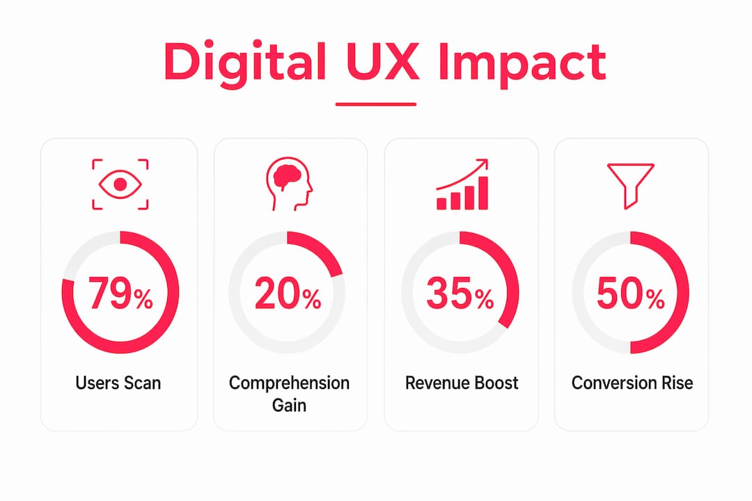
Whitespace is not wasted space. Effective use of whitespace increases visitor comprehension by nearly 20%. Comprehension drives confidence, and confidence drives purchase decisions. Cluttered pages do the opposite: they create doubt and send customers elsewhere.
The reputational cost of poor UX is equally significant. 44% of customers share negative UX experiences, actively harming brand reputation beyond the individual lost sale. One frustrated customer at checkout does not stay quiet. They tell colleagues, post reviews, and influence purchasing decisions for people who have never visited your site.
In ecommerce specifically, the relationship between UX quality and conversion is direct. Friction at checkout, unclear product information, and slow page loads each reduce the probability of a completed purchase. The importance of digital user experience compounds over time: brands that invest in UX build customer loyalty, while those that neglect it face increasing churn and acquisition costs.
- Scanning behaviour: Customers read in F-patterns and Z-patterns. Place your most critical information and calls to action where eyes naturally land.
- Visual hierarchy: Size, contrast, and spacing signal importance. Customers follow these signals unconsciously.
- Friction at checkout: Every unnecessary field, every confusing label, and every unexpected cost reduces conversion.
- Page speed: Slow load times increase abandonment before a customer has seen a single product.
What common pitfalls in digital UX design should businesses avoid?
The most damaging UX mistakes are rarely dramatic. They accumulate quietly across dozens of small decisions that each seem reasonable in isolation.
-
Feature bloat over friction removal. Adding new features feels like progress. Removing friction from existing journeys is harder to justify internally but delivers faster conversion gains. Friction removal from high-revenue pages, such as checkout forms, yields faster results than any new feature release.
-
Overcomplicating navigation. Navigation labels that are clever or branded rather than descriptive force customers to think. Standard navigation labels reduce scanning time and mental effort because customers recognise them instantly. “Shop” works. “Explore our world” does not.
-
Neglecting continuous feedback loops. UX is not a project with a delivery date. Customer behaviour changes, product catalogues grow, and market expectations shift. Businesses that treat UX as a one-off task find themselves with sites that felt modern at launch and feel dated within 18 months.
-
Mistaking aesthetic polish for functional usability. A beautifully designed page that confuses customers is a failure. Usability testing and real user feedback consistently reveal problems that internal teams, who are too close to the product, cannot see.
Pro Tip: Run a five-second test on your homepage with people who have never seen your site. Ask them what the page is for and what they should do next. If answers vary widely, your hierarchy needs work.
How can you improve digital user experience effectively?
Improving UX is a discipline, not a one-time fix. The most effective approach combines formal systems with continuous iteration informed by real data.
Build a design system first
Approximately 68% of large companies have adopted formal design systems to ensure visual and functional consistency at scale. A design system is a shared library of components, patterns, and guidelines that every designer and developer works from. It eliminates the inconsistency that erodes customer trust across large sites and multi-store setups. At Bigeyedeers, we use Figma to plan user journeys, wireframes, and interface systems before development begins, which means design decisions are made explicitly rather than by accident during build.
Prioritise your highest-friction, highest-value pages
Not all pages carry equal weight. Product detail pages, category pages, and checkout flows drive the majority of revenue. Optimising friction points on high-impact pages delivers measurable conversion improvements faster than spreading effort evenly across a site. Audit these pages with session recording tools and heatmaps before making changes, so you fix the right problems.
Combine quantitative metrics with qualitative research
The Digital Experience Score (DEX) and similar metrics quantify technical performance: load times, error rates, and task completion. Quantitative metrics reveal what happens; qualitative research explains why. Customer interviews and usability testing sessions surface the reasoning behind behaviour that data alone cannot explain. A successful digital experience strategy requires both.
Apply progressive disclosure to complex catalogues
For ecommerce businesses with large or complex product ranges, progressive disclosure is not optional. Presenting all product variants, specifications, and options simultaneously overwhelms customers and increases abandonment. Reveal detail progressively: category first, then subcategory, then product, then variant. This structure matches how customers naturally narrow their choices.
| Improvement area | Primary method | Expected outcome |
|---|---|---|
| Navigation clarity | Standard labels and consistent patterns | Reduced scanning time and lower bounce rate |
| Checkout friction | Form simplification and progress indicators | Higher completion rate |
| Information hierarchy | Progressive disclosure and whitespace | Improved comprehension and task focus |
| Design consistency | Formal design system (Figma-based) | Reduced cognitive load across all pages |
| UX measurement | DEX metrics combined with usability testing | Accurate diagnosis of real user problems |
Key takeaways
Digital user experience is the single most controllable factor in whether customers complete a purchase, return to your site, or recommend your brand to others.
| Point | Details |
|---|---|
| UX is broader than UI | UX covers the full customer journey; UI is only the visual layer within it. |
| Scanning behaviour shapes design | 79% of users scan rather than read, so hierarchy and whitespace are not optional. |
| Poor UX damages reputation | 44% of customers share bad experiences, making UX a brand risk, not just a usability issue. |
| Friction removal beats feature adding | Fixing high-friction pages like checkout delivers faster conversion gains than new features. |
| Measurement needs both data types | Combine quantitative metrics with qualitative research to understand what happens and why. |
UX is the one investment that compounds
After 17 years of building ecommerce sites, the pattern I see most often is this: businesses invest heavily in traffic acquisition and almost nothing in what happens after a customer arrives. They spend on paid search, social ads, and email campaigns, then send that hard-won traffic to a checkout that has not been tested in two years.
The uncomfortable truth about digital UX is that most sites are not failing because of bad design. They are failing because nobody is watching closely enough. Session recordings sit unreviewed. Customer service tickets flag the same navigation confusion month after month. Checkout abandonment rates stay elevated while the team debates the next feature release.
UX is not a project. It is a practice. The brands I have seen grow consistently are the ones that treat user research as a standing agenda item, not a pre-launch checkbox. They test, they measure, they fix, and they test again. That cycle is unglamorous, but it is what separates sites that convert from sites that merely exist.
The other thing worth saying plainly: empathy is a skill, not a sentiment. It means sitting with a customer while they use your site and resisting the urge to explain what they should be doing. What they actually do is the data. Everything else is assumption.
— Steve
How Bigeyedeers approaches UX for ecommerce
At Bigeyedeers, UX sits at the centre of every Magento and Shopify project we deliver. We plan user journeys and wireframes in Figma before a single line of code is written, which means design decisions are grounded in customer behaviour rather than internal preference.

Whether you are running a complex B2B catalogue on Adobe Commerce or a growing DTC brand on Shopify, the principles are the same: clear hierarchy, reduced friction, and continuous iteration informed by real data. Our team combines Magento web design expertise with Klevu search and Klaviyo lifecycle marketing to support both discovery and conversion across the full customer journey. If you want to understand where your site is losing customers and what to do about it, talk to our team about a UX review.
FAQ
What is digital user experience in simple terms?
Digital user experience is the overall impression a person forms when using a website, app, or digital product, covering how easy, useful, and satisfying the interaction feels. It includes every touchpoint from first landing on a page to completing a purchase or task.
How does UX differ from UI design?
UI (user interface) design covers the visual elements of a digital product: buttons, colours, and layout. UX is the broader discipline that determines whether those elements serve real customer needs across the full journey.
Why does digital UX matter for conversion rates?
Poor UX creates friction that stops customers completing purchases. Removing friction from high-value pages like checkout forms delivers faster conversion improvements than adding new features, and 44% of customers share bad experiences publicly, compounding the cost.
How do you measure digital user experience?
Effective UX measurement combines quantitative metrics such as the Digital Experience Score (DEX), task completion rates, and page load times with qualitative methods including usability testing and customer interviews. Neither approach alone gives the full picture.
What is the first step to improving UX on an ecommerce site?
Audit your highest-traffic, highest-revenue pages first. Use session recordings and heatmaps to identify where customers drop off, then prioritise friction removal on those pages before addressing lower-impact areas of the site.
Recommended


Adobe Commerce (Magento)
Formerly known as Magento, Adobe Commerce is built for complex catalogues, integrations, and long term growth. We design and develop stable, scalable stores that support demanding eCommerce requirements, including multi-store setups, complex pricing, and Hyva based performance improvements.

Bespoke Build
We design and build custom eCommerce platforms for businesses with complex workflows, integrations, or non standard requirements. Built from scratch around your business needs using Laravel and modern architectures.

Working with brands across the UK from our offices in Cardiff and Exeter, you deal directly with a senior team of designers and developers specialising in Shopify, Magento, WordPress and bespoke eCommerce platforms.
We focus on commercial outcomes. Better conversion rates, strong SEO foundations and eCommerce platforms that continue to improve long after launch.