How to streamline checkout process: 2026 guide
TL;DR:
- Checkout friction causes significant revenue loss in e-commerce, especially at the payment stage. Streamlining checkout through audit-based design, mobile-first development, and diverse payment options boosts conversion rates and reduces abandonment. Continuous testing and customer feedback ensure ongoing optimization, with guest checkout and express payments delivering quick wins.
Checkout friction is costing you money right now. Research consistently shows that the checkout page is where the greatest share of e-commerce revenue disappears, with complicated forms, forced account creation, and limited payment options pushing customers to abandon their baskets at the last moment. Knowing how to streamline checkout process design is therefore one of the highest-return investments you can make in your store. This guide covers everything from preparation and structural design to payment optimisation and analytics, giving you a practical framework to reduce cart abandonment and improve conversion rates in 2026.
Table of Contents
- Key takeaways
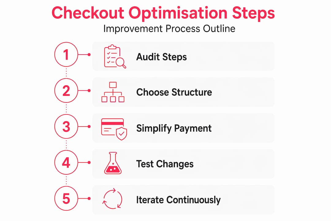
- How to streamline checkout process: start with an audit
- Checkout structure: one-page vs multi-step
- Payment experience: the most critical drop-off point
- Testing and verifying your improvements
- My honest take on checkout optimisation
- How Bigeyedeers can improve your checkout
- FAQ
Key takeaways
| Point | Details |
|---|---|
| Audit before you change anything | Map your current checkout flow step by step and identify exactly where customers are dropping off. |
| Guest checkout first | Offer guest checkout as the default and invite account creation only after the order is complete. |
| One-page layout reduces abandonment | A single-page checkout reduces cart abandonment by roughly 20% by giving shoppers full process visibility upfront. |
| Payment diversity is non-negotiable | Offering multiple payment methods, including digital wallets and BNPL, lifts conversion rates by 12 to 15%. |
| Measure at the step level | Track drop-offs at each individual checkout step, not just overall basket abandonment, to identify the real bottlenecks. |
How to streamline checkout process: start with an audit
Before you touch a single form field, you need to understand where your checkout is actually breaking down. Generic assumptions about “too many steps” are rarely the whole story. The real issue is almost always at a specific, identifiable moment in the flow.
Pull your step-level analytics and ask a few honest questions:
- Where is the highest drop-off rate? Is it the address form, the payment page, or the moment customers see the delivery cost for the first time?
- What is your mobile abandonment rate versus desktop? Nearly 75% of e-commerce traffic now comes from mobile devices, so a mobile-specific problem can easily look like a general checkout problem.
- How many form fields are you asking customers to complete? Every unnecessary field is a reason to leave. Asking only for essential information keeps the flow clear and friction low.
- Do you require account creation before purchase? Guest checkout as default, with account creation offered after the transaction, consistently improves conversion.
This preparation phase is not glamorous, but it is where the most impactful decisions get made. Skipping it means you will make changes that feel logical but do not address your store’s specific friction points.
Pro Tip: If you do not have step-level funnel tracking set up, add it before making any changes. Even a basic Google Analytics 4 funnel report will show you exactly which step is the primary culprit.
Checkout structure: one-page vs multi-step
Once you understand where customers are dropping off, the next decision is structural. Should you move to a one-page checkout, or refine an existing multi-step flow?
| Format | Strengths | When to use it |
|---|---|---|
| One-page checkout | Full process visibility, fewer back-and-forth navigations, lower abandonment on mobile | High-volume DTC stores, simpler product ranges, mobile-heavy audiences |
| Multi-step checkout | Easier to manage complex data collection, less overwhelming for long forms | B2B, configurable products, stores requiring detailed delivery options |
The evidence in favour of one-page checkout is strong. Process visibility reduces uncertainty and back-navigation drop-off, particularly for mobile shoppers who find switching between steps more disruptive than desktop users do.

That said, a well-executed multi-step checkout can perform just as well if you get the details right. Visible progress indicators showing the current step and the number remaining significantly reduce anxiety. A persistent order summary visible on every step reassures customers about what they are buying without requiring them to navigate backwards.
Form design is where most checkouts quietly lose customers. A few changes here can have an outsized effect:
- Combine first name and last name into a single field where your system permits it.
- Remove the “Address line 2” field or make it clearly optional rather than leaving it to confuse customers.
- Use autofill attributes correctly so browsers can populate address and payment fields automatically.
- Apply inline validation on forms so errors are flagged as customers type rather than after they submit, which preserves their input and avoids frustration.
- Pre-select the most common country and currency based on the visitor’s location.
Pro Tip: Run a short session recording review using a tool like Hotjar before and after any form changes. You will often see customers hesitate or re-enter data in fields that look fine statistically but cause confusion in practice.
Payment experience: the most critical drop-off point
Payment is where purchase intent either converts or evaporates. Customers who reach the payment step have already committed emotionally. Losing them here is the most preventable kind of abandonment.
Offering multiple payment methods lifts conversion by 12 to 15%, and the gap is widening as digital wallets become the default for younger shoppers. Your minimum viable payment stack in 2026 should cover:
- Card payments with clear, familiar input patterns and numeric keyboard triggering on mobile.
- Apple Pay and Google Pay, which remove address and card entry entirely for eligible devices.
- Buy Now Pay Later (BNPL) options such as Klarna or Clearpay, particularly valuable for higher average order values.
- PayPal, which still carries strong trust signals for customers hesitant to enter card details directly.
Express checkout buttons are worth special attention. Placing express checkout buttons at the product page, cart, and checkout stages lets motivated buyers skip intermediate steps entirely, which is especially effective on mobile where every extra tap adds friction.
On mobile specifically, the input experience matters as much as the payment options themselves. Triggering the numeric keyboard for card number and CVV fields, auto-spacing card numbers as they are typed, and supporting saved credentials via the browser or device all reduce the effort required at the most sensitive moment in the funnel. Payment method discoverability and input effort consistently outweigh visual design in determining whether a customer completes the transaction.
Payment error handling is an area many stores get badly wrong. A vague “payment failed” message with no guidance leaves customers stuck. Clear, specific error messages that tell the customer what went wrong and suggest an immediate next step, whether that is re-entering a card number, trying a different payment method, or contacting their bank, keep the transaction moving rather than ending it.
Pro Tip: Test your payment flow from a real mobile device on a 4G connection, not a desktop browser in mobile emulation mode. The difference in load time and input behaviour is significant, and it is the experience your majority audience actually has.
Testing and verifying your improvements
Making changes without measuring them is guesswork. The stores that consistently improve their checkout experience treat it as an ongoing programme of data-led iterations rather than a one-off project.
Here is a practical testing framework:
- Baseline your metrics. Before any change goes live, record your current step-level drop-off rates, overall checkout conversion rate, mobile versus desktop split, and average time to complete checkout.
- Run A/B tests on structural changes. Step-level analytics combined with A/B testing validate whether a change actually improves outcomes or just looks better. Never assume.
- Monitor load times after each release. A checkout page that adds 500 milliseconds of load time due to a new payment widget can cost more in conversions than the feature gains.
- Track error rates at the payment step. A spike in payment errors often points to a processor issue, a specific card type failing, or a mobile input problem that would otherwise go unnoticed.
- Collect customer feedback post-purchase. A short survey asking what, if anything, nearly stopped them completing the order surfaces qualitative insight that analytics alone cannot provide. Driving retail growth through customer feedback is a consistently underused advantage.
| Metric | What it tells you |
|---|---|
| Step-level drop-off rate | Pinpoints exactly which step is causing the most abandonment |
| Mobile vs desktop conversion gap | Indicates whether mobile checkout UX needs prioritising |
| Payment error rate | Flags processor issues, input problems, or unsupported payment methods |
| Time to complete checkout | Measures overall friction level; a decrease usually confirms improvements are working |
The goal is continuous iteration. Your competitors are not standing still, customer expectations are rising, and device behaviour is changing. A checkout that converts well today needs regular review to stay that way.
My honest take on checkout optimisation
I have seen a lot of stores rush into checkout redesigns chasing a headline metric, usually “fewer steps”, and end up in a worse position than before. Here is what I have actually learned from working on these problems across Magento and Shopify builds over many years.
The most common mistake is treating step count as the primary variable. In my experience, a three-step checkout with excellent form design, fast load times, and clear trust signals will outperform a one-page checkout that is poorly structured or cluttered. Removing steps is not the point. Removing friction is the point, and friction lives in the details.
I have also found that security signals are systematically underestimated. Customers, particularly first-time buyers, are making a judgement call about whether to trust your store with their payment details. Maintaining order summaries and security signals visible throughout checkout is not decoration. It is active conversion work. A padlock icon, a recognised payment badge, and a clear returns policy cost nothing to display and consistently lift confidence at the moment of maximum doubt.
Mobile gets said a lot but acted on too rarely. Most teams test on desktop first and treat mobile as a secondary pass. Flip that. Start every checkout design review on a real mid-range Android device over 4G. That is the median experience for a large share of your customers, and it is usually humbling. For practical guidance on what mobile-first checkout design actually requires, our resource on mobile-responsive web design is a good starting point.
Finally: guest checkout combined with a post-purchase account creation invitation is, in my view, the single most underrated tactic in e-commerce. For returning customers, fast login options and eliminating repeated data entry reduce re-purchase friction significantly. Do both. Do not make customers choose between speed and having an account.
— Steve
How Bigeyedeers can improve your checkout

At Bigeyedeers, we have been designing and building high-performing e-commerce stores on Magento and Shopify for over 17 years. Checkout optimisation is not something we bolt on at the end of a project. It is built into how we design every store from the outset, starting with Figma-based user journey mapping to identify friction before a single line of code is written.
Whether you need a Magento checkout redesign or a Shopify-focused conversion improvement, we bring the same data-led approach: audit, design, build, test, and iterate. Our team also supports ongoing improvements through analytics review, A/B testing frameworks, and mobile performance work. If your checkout is costing you conversions and you want a frank assessment of where the problems are, get in touch with our team and we will take a look.
FAQ
What is the fastest way to reduce cart abandonment at checkout?
Enabling guest checkout and adding express payment options such as Apple Pay and Google Pay are typically the fastest wins. Both remove the highest-friction barriers without requiring structural redesign.
Does one-page checkout always outperform multi-step?
Not always. One-page checkout reduces abandonment by around 20% on average, but a well-structured multi-step checkout with progress indicators and persistent order summaries can match that performance for stores with complex data requirements.
How many form fields should a checkout have?
As few as your fulfilment process genuinely requires. Stripe’s guidance recommends collecting only the information needed to complete the order, with everything else either removed or made clearly optional.
How do I know if my checkout improvements are working?
Track step-level drop-off rates before and after each change, and run A/B tests on significant alterations. Step-level analytics and customer feedback together give you both the numbers and the context to interpret them correctly.
What payment methods should every UK e-commerce store offer?
At minimum: cards, Apple Pay, Google Pay, PayPal, and at least one BNPL option. This combination covers the payment preferences of the vast majority of UK shoppers and addresses the most common reasons customers abandon at the payment step.
Recommended


Adobe Commerce (Magento)
Formerly known as Magento, Adobe Commerce is built for complex catalogues, integrations, and long term growth. We design and develop stable, scalable stores that support demanding eCommerce requirements, including multi-store setups, complex pricing, and Hyva based performance improvements.

Bespoke Build
We design and build custom eCommerce platforms for businesses with complex workflows, integrations, or non standard requirements. Built from scratch around your business needs using Laravel and modern architectures.

Working with brands across the UK from our offices in Cardiff and Exeter, you deal directly with a senior team of designers and developers specialising in Shopify, Magento, WordPress and bespoke eCommerce platforms.
We focus on commercial outcomes. Better conversion rates, strong SEO foundations and eCommerce platforms that continue to improve long after launch.