How to optimise ecommerce UX for online sales growth
TL;DR:
- Poor user experience causes significant cart abandonment and revenue loss for UK ecommerce brands.
- Continuous UX auditing, mapping, testing, and refinement are essential for sustained growth.
- Partnering with specialists can accelerate improvements and maximize long-term sales.
Picture this: a shopper lands on your site, adds a product to their basket, hits the checkout page, and then disappears. No purchase, no message, just gone. If that sounds familiar, you’re not alone. 70% of cart abandonment is traceable to fixable problems like hidden costs, complex navigation, and clunky checkout flows. Poor user experience (UX) is quietly costing UK ecommerce brands significant revenue every single day. This guide walks you through a practical, step-by-step framework for auditing, redesigning, implementing, and continuously refining your store’s UX so you can convert more visitors, reduce frustration, and build lasting customer loyalty.
Table of Contents
- Assess your current user experience: setting your baseline
- Map and redesign your users’ journeys
- Implement high-impact UX optimisations
- Test, validate and refine your optimisations
- Our perspective: Why ‘optimising’ is never finished
- Partner with specialists to accelerate your UX transformation
- Frequently asked questions
Key Takeaways
| Point | Details |
|---|---|
| Start with audit | Use analytics, heatmaps, and customer input to pinpoint your site’s UX weaknesses. |
| Redesign for clarity | Simplified navigation, advanced search, and mobile-first improvements drive the biggest sales gains. |
| Streamline checkout | Guest checkout and early cost visibility can quickly reduce abandonment rates. |
| Continuous testing | Ongoing A/B testing and integrating UX updates with SEO and CRO sustain sales improvement. |
Assess your current user experience: setting your baseline
Once you grasp the stakes, it’s time to measure your starting point. You can’t improve what you haven’t measured, and a proper UX audit is the foundation of everything that follows. Think of it as a health check for your online store.
A solid audit draws on three sources of evidence: quantitative analytics, behavioural data from heatmaps, and direct customer feedback. Together, these analytics, heatmaps, and journey mapping tools give you a layered picture of where users struggle and where they thrive.
Here are the key metrics to track during your audit:
- Bounce rate by page: High bounce on product pages often signals mismatched expectations or slow load times.
- Cart abandonment rate: Your single most revealing revenue metric.
- Mobile vs desktop conversion gap: A wide gap points to mobile UX problems.
- Session recordings: Watch where real users hesitate, scroll back, or rage-click.
- Exit survey responses: Even a one-question exit survey can uncover patterns quickly.
| Metric | Warning threshold | Action trigger |
|---|---|---|
| Bounce rate | Above 60% | Review page content and load speed |
| Cart abandonment | Above 70% | Audit checkout flow immediately |
| Mobile conversion gap | More than 15 points | Prioritise mobile UX fixes |
| Average session time | Under 90 seconds | Improve engagement and navigation |
Once you’ve gathered data, synthesise it into a prioritised actions list. Group findings by impact and effort: quick wins first, then longer-term structural changes. Our UX improvement guide covers this prioritisation in more detail, and it’s worth reading alongside your audit output.
Pro Tip: Don’t rely solely on averages. Segment your data by device type, traffic source, and new vs returning visitors. Patterns that are invisible in aggregate become obvious when you slice the data properly.
For a thorough walkthrough of the full process, our step-by-step audit resource is a practical reference to keep open while you work.
Map and redesign your users’ journeys
With priorities set, you need a visual map to plan targeted improvements. A user journey map takes the raw data from your audit and turns it into a story: where someone enters your site, what they’re trying to do, where friction appears, and where you lose them.
Building a useful journey map doesn’t require expensive software. Start with these steps:
- Define your key user personas (new visitor, returning customer, wholesale buyer).
- Identify the core tasks each persona needs to complete (find a product, compare options, checkout).
- Map the actual steps taken using session recordings and analytics path reports.
- Mark every friction point, drop-off, and moment of confusion on the map.
- Prioritise redesign efforts based on the volume of users affected and the revenue at stake.
Tools like Figma are particularly useful here. Mapping user flows with Figma allows your team to visualise wireframes, test interface logic, and align on decisions before a single line of code is written. We use this approach on every project, and it consistently reduces costly late-stage changes.
When redesigning, separate your quick fixes from deeper structural work:
| Type of change | Example | Typical timeframe |
|---|---|---|
| Quick fix | Simplify main navigation labels | 1 to 3 days |
| Quick fix | Add breadcrumb trails | 1 to 2 days |
| Structural redesign | Rebuild category hierarchy | 2 to 4 weeks |
| Structural redesign | Overhaul mobile layout | 3 to 6 weeks |
Navigation clarity, search functionality, page speed, and visual hierarchy are your four redesign priorities. Use your website feature checklist to ensure you’re covering everything that affects conversion.

Pro Tip: Involve your customer service team in journey mapping sessions. They hear complaints every day that never make it into your analytics, and their insight is genuinely invaluable.
Implement high-impact UX optimisations
Armed with a map, you can now implement changes that matter most to your business. Not all UX improvements are equal. The ones below consistently deliver the strongest results for UK ecommerce brands, and many are achievable without a full site rebuild.
Simplify navigation and improve search
Reduce top-level navigation items to seven or fewer. Add a sticky header so the menu stays accessible as users scroll. For search, autocomplete and AI-powered filters dramatically improve product discovery. Tools like Klevu integrate directly with Magento and Shopify to deliver smarter search results with minimal development effort.
Speed up your site
Every second of load time costs you conversions. Compress images, use a content delivery network, and audit third-party scripts that bloat your page weight. Review your shop platform UX to understand how Magento and Shopify handle performance differently.
Design for mobile first
67% of UK ecommerce users report frustration with small links and cramped layouts on mobile. Increase tap target sizes, use a single-column layout for product pages, and eliminate horizontal scrolling completely.
Streamline checkout
“70% of checkout abandonment is fixable via guest checkout and displaying costs early.” Baymard Institute benchmarks make this one of the highest-ROI changes you can make.
Offer guest checkout as the default option. Show total costs including delivery and VAT before the payment step. Reduce form fields to the absolute minimum. These changes alone can significantly lift conversions.
Add trust signals
Security badges, verified reviews, and return policy clarity all reduce purchase anxiety. Notably, adding the Google store widget to your product listings can boost sales by 8% through increased buyer confidence. That’s a small technical addition with a measurable commercial return.
Test, validate and refine your optimisations
With changes rolled out, it’s vital to check they’re landing well and delivering results. Implementation without validation is guesswork. A structured testing approach ensures you’re making decisions based on evidence, not instinct.
Here’s a practical validation cycle to follow:
- Define your success metric before testing: Is it conversion rate, average order value, or checkout completion? Set one primary goal per test.
- Run A/B tests on individual changes: Test one variable at a time so results are attributable and clear.
- Run tests for at least two full business weeks: Shorter tests produce unreliable data, particularly across weekday and weekend traffic patterns.
- Segment results by device: Mobile satisfaction lags desktop by 10 to 15 points, so a test that looks neutral overall may be masking a mobile failure.
- Collect qualitative feedback post-change: Brief on-site surveys or follow-up emails reveal the ‘why’ behind the numbers.
“Integrating UX with SEO and CRO is essential for long-term sales growth.” Treating these as separate workstreams means you’ll optimise in circles rather than forward.
This is where UX connects directly to your broader commercial strategy. Faster pages improve Google rankings. Better navigation reduces pogo-sticking (when a user clicks a search result and immediately returns to the results page). Lower abandonment rates improve your return on ad spend. These aren’t separate workstreams; they reinforce each other.
A well-structured CRO workflow ties everything together, ensuring that testing and iteration become a permanent part of how your team operates rather than a one-off project.
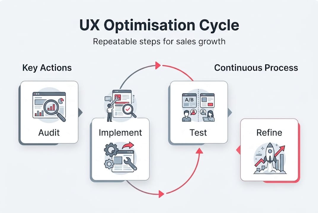
Our perspective: Why ‘optimising’ is never finished
Here’s the uncomfortable truth we share with every client: UX optimisation is not a project with a finish line. It’s a permanent operating mode.
We’ve seen brands invest heavily in a site redesign, achieve a solid uplift in conversions, and then treat the work as done. Twelve months later, those gains have eroded. Why? Because user behaviour shifts, device capabilities evolve, competitor benchmarks rise, and customer expectations quietly reset.
The teams that maintain a real edge treat UX as a growth loop: audit, implement, test, refine, and repeat. Each cycle produces compounding gains because every improvement makes the next one easier to identify and more precise to target.
The biggest pitfall we see is the checklist mentality, where teams tick off UX recommendations and move on. A checklist tells you what to do once. A growth loop tells you what to do next, always.
Investing in UX post-launch is where the real commercial returns accumulate. The brands that understand this stop asking ‘Is our UX good enough?’ and start asking ‘What does our data tell us to improve right now?’
Partner with specialists to accelerate your UX transformation
If you want to shortcut the learning curve and avoid wasted spend, expert help is available. Applying this framework takes time, resource, and specialist knowledge that most in-house teams are stretched to provide on top of day-to-day operations.

At Big Eye Deers, we’ve spent over 17 years designing, building, and supporting high-performing ecommerce stores for UK retail brands on Shopify and Magento. From UX audits and Figma-led journey mapping to Klevu search integration and checkout optimisation, we cover the full stack of improvements covered in this guide. If you’re ready to turn UX into a consistent revenue driver rather than an ongoing frustration, explore our full range of ecommerce services or get in touch to discuss a tailored audit for your store.
Frequently asked questions
What are the biggest UX mistakes for ecommerce sites?
The most common mistakes are complex navigation and slow loading, unclear checkout costs, and failing to optimise the experience for mobile users. These issues account for the majority of avoidable revenue loss.
How does mobile optimisation impact ecommerce conversion rates?
Mobile traffic now accounts for over 60% of visits to most UK ecommerce stores, yet mobile lags desktop by 10 to 15 points in satisfaction scores when the mobile experience isn’t properly addressed. Closing that gap directly improves your revenue per visitor.
Which UX improvement yields the fastest sales uplift?
Enabling guest checkout and displaying all costs early in the checkout process typically deliver the quickest measurable gains, because 70% of abandonment at checkout is caused by friction that these two changes directly remove.
How often should I update or review my ecommerce UX?
Review your site at least quarterly using analytics and structured feedback, but monitor key metrics monthly. The iterative approach of continuous UX testing ensures you catch problems before they compound into significant revenue loss.
Recommended


Adobe Commerce (Magento)
Formerly known as Magento, Adobe Commerce is built for complex catalogues, integrations, and long term growth. We design and develop stable, scalable stores that support demanding eCommerce requirements, including multi-store setups, complex pricing, and Hyva based performance improvements.

Bespoke Build
We design and build custom eCommerce platforms for businesses with complex workflows, integrations, or non standard requirements. Built from scratch around your business needs using Laravel and modern architectures.

Working with brands across the UK from our offices in Cardiff and Exeter, you deal directly with a senior team of designers and developers specialising in Shopify, Magento, WordPress and bespoke eCommerce platforms.
We focus on commercial outcomes. Better conversion rates, strong SEO foundations and eCommerce platforms that continue to improve long after launch.