Web Design in Branding: Driving Ecommerce Growth
A customer’s first impression of your brand often forms before they ever read a product description or speak to your team. For ecommerce managers using Magento or Shopify, your website truly becomes the digital face of your business. Research from University College London shows that visual attributes and usability are powerful tools that shape how visitors perceive your brand. Crafting a cohesive, user-friendly site means every pixel can build trust and set your business apart in a crowded UK retail market.
Table of Contents
- Web Design As The Face Of Your Brand
- Key Elements Shaping Digital Brand Identity
- User Experience And Impact On Trust
- Brand Consistency Across Ecommerce Platforms
- Common Pitfalls In Ecommerce Web Design
Key Takeaways
| Point | Details |
|---|---|
| Importance of Design | Web design is crucial in shaping customer perceptions and can influence their decision to stay or leave your site. |
| Consistency is Key | Maintaining consistent branding across all platforms enhances recognition and builds trust among customers. |
| User Experience Matters | A fast, clear, and responsive user experience is essential for retaining visitors and converting them into customers. |
| Avoid Common Mistakes | Cluttered layouts, poor navigation, and weak calls to action are significant pitfalls that can hinder sales and brand perception. |
Web design as the face of your brand
Your website is often the first place customers encounter your brand. Before they touch your products, read your about page, or speak to your team, they’re forming opinions based purely on design. This isn’t superficial. Visual attributes and usability significantly shape how visitors perceive your brand and decide whether to stay or leave.
Brands function as relationship facilitators that shape how customers see themselves. Your web design directly influences these emotional connections. Inconsistent typography, slow load times, confusing navigation, or dated visuals send the wrong message about who you are. A mid-sized UK retail brand selling premium goods through a clunky interface looks anything but premium. The design becomes the story customers tell themselves about your brand before any transaction happens.
Consider how a customer journey unfolds. They arrive through a search result or social media link. Your homepage loads. The colour palette, spacing, imagery, and layout all communicate instantly. Within seconds, they’re making judgements about professionalism, trustworthiness, and whether your products are worth exploring. For Magento and Shopify managers, this means your design system isn’t just about aesthetics. It’s about conversion, retention, and whether visitors return.
Brands that invest in cohesive web design typically see measurable differences in how customers engage. Matching your design to your brand values, target audience, and product positioning creates recognition. When someone visits your Shopify store and immediately understands what you do and why they should care, that’s strategic design working. When they navigate products intuitively, find what they need without friction, and feel confident at checkout, that’s design protecting your reputation and revenue.
Your website reflects brand identity in every pixel. Fonts, colours, imagery, whitespace, and button styles all work together to communicate your position in the market. A luxury brand’s design differs dramatically from a value retailer’s, as it should. The design reinforces expectations and builds trust before a single customer interacts with your products.
Here is a summary of how different web design elements influence brand perception:
| Design Element | Example Impact on Brand | Common Mistake | Customer Reaction |
|---|---|---|---|
| Typography | Signals professionalism | Inconsistent typography | Perceived as unreliable |
| Colour Palette | Communicates values | Random colour use | Confusion or mistrust |
| Imagery | Reflects product quality | Overused stock images | Brand seen as generic |
| Navigation | Facilitates exploration | Overcomplicated menus | Visitor drop-off |
| Load Speed | Shows attention to detail | Slow homepages | Abandonment |
Pro tip: Before redesigning or optimising your site, audit how your current design aligns with your brand values and competitive positioning, then map required changes through Figma wireframes before development to ensure every design decision supports your commercial goals.
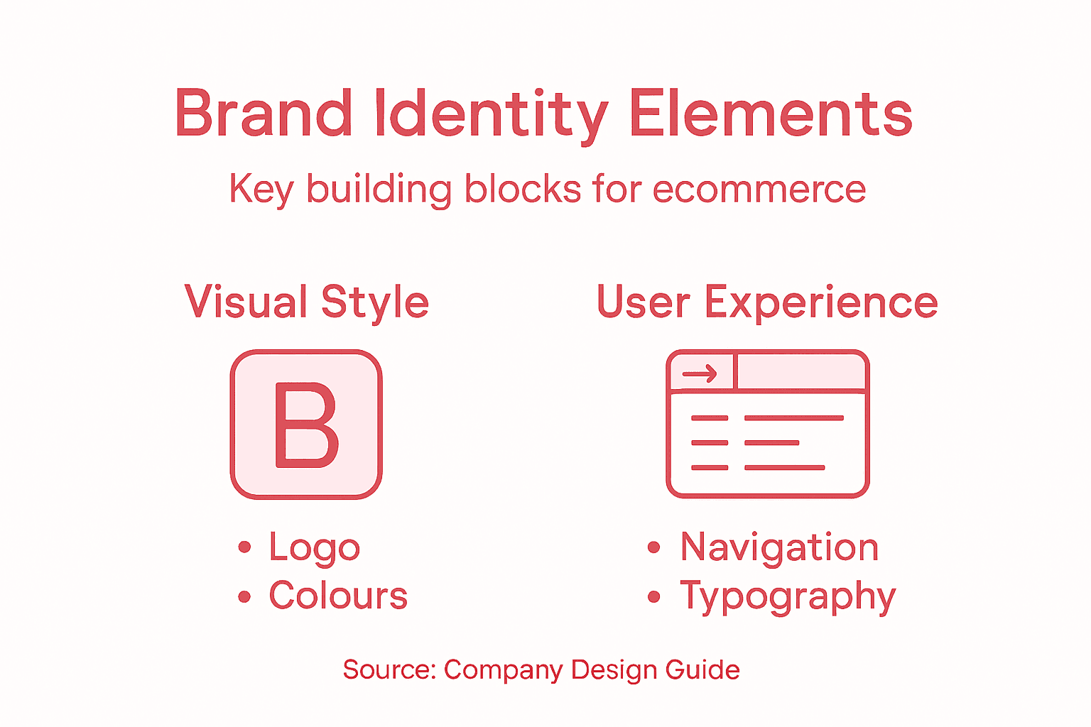
Key elements shaping digital brand identity
Digital brand identity isn’t built from a single design choice. It’s the sum of dozens of deliberate decisions working together to create recognition and trust. When someone lands on your Magento or Shopify store, they’re experiencing the combined effect of logos, colours, typography, imagery, and how your brand actually speaks to them.
Consistency across these elements is where the magic happens. Your logo should look identical on your homepage, product pages, and checkout. Your colour palette should feel intentional, not random. The typefaces you choose for headlines should complement the ones used for product descriptions. Visual identity through consistent design elements strengthens differentiation and builds the kind of loyalty that keeps customers returning.
Tone of voice matters just as much as visual design. How you write product descriptions, customer service responses, and marketing copy shapes perceptions as much as colours do. A luxury brand’s voice differs dramatically from a value retailer’s. Your tone should reinforce your visual identity, making the brand experience cohesive across every touchpoint. This is where many mid-sized retailers stumble. They have beautiful designs but inconsistent messaging that confuses their audience about who they actually are.
Imagery is another critical component. The photographs, illustrations, and icons you use should align with your brand positioning. They should tell a consistent story about your products and values. Stock photography that looks generic undermines premium positioning. Custom or carefully curated imagery signals that you’ve invested in your brand.
When these elements work together, something powerful happens. Customers develop instant recognition. They trust your brand more quickly. They’re more likely to complete purchases and recommend you to others. For ecommerce managers, this cohesion directly impacts conversion rates and customer lifetime value.
Pro tip: Document all your brand elements (logos, colours, typography, tone guidelines) in a single accessible file, then audit your Magento or Shopify store against these standards to identify inconsistencies before they damage customer perception.
User experience and impact on trust
Trust doesn’t appear instantly. It builds through hundreds of small interactions. When a customer lands on your store, their brain processes speed, clarity, and professionalism in milliseconds. A slow homepage, confusing navigation, or cluttered product pages signal carelessness. A fast, clean, well-organised store signals competence. That’s the difference between a visitor who stays and one who leaves.

Fast load speeds and clear navigation create the foundation for trust. When pages load instantly and customers find what they need without hunting, they feel respected. When checkout flows smoothly without unexpected friction, confidence builds. For Magento and Shopify managers, these aren’t nice-to-haves. They’re essential. A two-second delay in page load can reduce conversions measurably. Confusing checkout processes abandon carts by the thousands.
Readability matters more than you might think. Text that’s too small, lines too long, or contrast too low frustrates visitors. They start doubting whether your brand is legitimate. They wonder if you care about their experience. Simple typography, generous whitespace, and proper hierarchy make scanning effortless. When customers can understand your product benefits instantly, trust follows naturally.
Responsiveness across devices matters equally. More than 60% of ecommerce traffic comes from mobile devices. A website that looks terrible on phones signals that you haven’t invested in modern standards. Visitors abandon unresponsive stores quickly. They assume you’re either outdated or untrustworthy. Mobile optimisation isn’t optional anymore.
Consistency throughout the experience reinforces trust. The same colours, buttons, and interactions across every page create reliability. When something works one way on your homepage and differently on a product page, customers feel confused. That confusion erodes trust faster than almost anything else. Consistency communicates that you’ve thought through every detail.
Compare effective versus ineffective user experiences in ecommerce environments:
| Aspect | Effective Experience | Ineffective Experience | Business Outcome |
|---|---|---|---|
| Page Speed | Instantly loading pages | Noticeable delays | Higher conversion rates |
| Navigation | Clear, intuitive structure | Confusing, cluttered links | Reduced sales potential |
| Readability | High contrast, legible text | Small fonts, poor contrast | Less trust, lost visitors |
| Mobile Design | Fully responsive layout | Broken or unstyled layouts | Greater mobile revenue |
Pro tip: Test your store’s actual load speed, mobile responsiveness, and checkout flow using real user data rather than assumptions, then prioritise fixes based on where friction actually costs you conversions.
Brand consistency across ecommerce platforms
Many UK retail brands operate across multiple sales channels. You might sell through your own Shopify store, a Magento marketplace, Amazon, and social commerce simultaneously. Each platform has different design constraints, different audiences, and different technical capabilities. The temptation is to let each platform develop its own look and feel. That’s a mistake that costs you customer trust and recognition.
When customers encounter your brand across different platforms, they should instantly recognise you. Your logo should look identical. Your colours should match precisely. Your typography should feel consistent. Brand guidelines for consistent logos and colour schemes reinforce recognition and create a seamless experience regardless of where customers shop. When someone buys from your Shopify store and later sees your brand on Amazon, they should feel like they’re interacting with the same company, not discovering something new.
Messaging consistency matters equally. Your tone of voice, product descriptions, and customer service language should sound the same everywhere. If your brand voice is playful and conversational on your website but formal and corporate on social media, customers feel confused. That inconsistency erodes trust. A mid-sized retailer with a clear brand voice will outperform one that sounds different on every platform.
Platform differences don’t excuse inconsistency. Yes, Amazon has restrictions on what you can control. Yes, social commerce platforms have limited design options. But within those constraints, you can maintain your brand identity. Use your approved colour palette even if you can’t customise the background. Use your brand voice even in character-limited fields. Small choices accumulate into recognition or confusion.
Documentation is your safeguard. Without clear brand guidelines, different team members make different choices. Your Shopify manager uses one logo version. Your Amazon specialist uses another. Your social media person uses a third. Suddenly your brand looks fractured. A simple brand guidelines document prevents this chaos and ensures everyone knows what represents your brand accurately.
Pro tip: Create a central brand asset library accessible to all team members managing different platforms, with clear guidelines on logo usage, colour values, typography, and tone, then audit each platform quarterly to catch inconsistencies before customers notice them.
Common pitfalls in ecommerce web design
Mistakes in web design accumulate quietly. A visitor arrives. The page feels cluttered. Navigation confuses them. They leave. You never see the lost sale in your analytics until it’s too late. By then, hundreds of potential customers have already abandoned your store. The difference between a thriving ecommerce business and a struggling one often comes down to avoiding these preventable design errors.
Cluttered layouts are the biggest offender. Too many elements competing for attention overwhelm visitors. Too many product categories, too many banner ads, too many pop-ups. It feels chaotic. When everything is trying to be noticed, nothing stands out. A clean, purposeful layout with breathing room guides customers naturally toward what matters. Whitespace isn’t wasted space. It’s strategic breathing room that makes decisions easier.
Poor navigation and long load times drive customers away instantly. If someone can’t find what they’re looking for within three clicks, they leave. If your homepage takes five seconds to load on a mobile device, they’re gone. These aren’t minor inconveniences. They’re conversion killers. Every second of delay costs you revenue.
Weak calls to action represent another critical mistake. Visitors should always know what you want them to do next. Buy now. Add to cart. Sign up. Read more. If your call to action buttons are unclear, buried, or visually weak, conversions suffer. A prominent, contrasting button with clear copy increases clicks dramatically. Make it obvious what the next step is.
Non-responsive design on mobile devices is inexcusable in 2024. More than half of ecommerce traffic originates from phones and tablets. A website that looks terrible on mobile isn’t just inconvenient. It signals that your business is outdated or careless. Mobile responsiveness isn’t optional. It’s fundamental to staying competitive.
Pro tip: Test your store on real devices using actual customer networks rather than perfect office conditions, then prioritise fixing the highest friction points based on where visitors actually abandon their journeys.
Elevate Your Brand with Expert Ecommerce Web Design
Your website is the frontline of your brand’s story and trust. As highlighted in the article “Web Design in Branding Driving Ecommerce Growth” poor typography inconsistent branding and slow load speeds can silently erode customer confidence and sales. Big Eye Deers understands these challenges and delivers tailored solutions on Magento and Shopify platforms designed to create seamless user experiences that reflect your brand values and boost conversions.

Discover how our skilled team uses Figma wireframes to plan every detail of UX and design ensuring your ecommerce store is not only visually cohesive but performs flawlessly on all devices. With over 17 years of UK expertise we focus on fast loading pages intuitive navigation and consistent brand identity across all sales channels. Don’t let subtle design flaws hold your business back. Visit Big Eye Deers to start your journey towards a high-performing ecommerce platform built for long-term growth. See how our Magento and Shopify expertise build secure engaging stores that turn visitors into loyal customers.
Frequently Asked Questions
How does web design affect brand perception?
Web design significantly influences how visitors perceive a brand. Elements like typography, colour palettes, and imagery all communicate professionalism and trust, impacting whether customers stay on a site or leave.
What are the key elements of effective web design for ecommerce?
Key elements include consistent typography, a coherent colour palette, high-quality imagery, intuitive navigation, and fast load speeds. These factors collectively enhance user experience and drive conversions.
Why is user experience important for building trust in an online store?
User experience is vital because it affects how quickly and easily customers can navigate a website. A fast, clear, and organised site signals competence and care, fostering customer trust and loyalty.
How can brands maintain consistency across multiple sales channels?
Brands can ensure consistency by adhering to strict brand guidelines that cover logos, colour schemes, typography, and tone of voice. Regular audits of each platform help identify and rectify any inconsistencies.
Recommended
- Ecommerce Branding Workflow for High-Impact UK Stores
- Role of Web Design in Sales: Key Drivers for UK Ecommerce
- Design for Success: the Importance of eCommerce Web Design
- Why Use Professional Web Design for Ecommerce Success
- Sustainable Fashion Workflow: Transforming Ethical Accessories – The Cork Store


Adobe Commerce (Magento)
Formerly known as Magento, Adobe Commerce is built for complex catalogues, integrations, and long term growth. We design and develop stable, scalable stores that support demanding eCommerce requirements, including multi-store setups, complex pricing, and Hyva based performance improvements.

Bespoke Build
We design and build custom eCommerce platforms for businesses with complex workflows, integrations, or non standard requirements. Built from scratch around your business needs using Laravel and modern architectures.

Working with brands across the UK from our offices in Cardiff and Exeter, you deal directly with a senior team of designers and developers specialising in Shopify, Magento, WordPress and bespoke eCommerce platforms.
We focus on commercial outcomes. Better conversion rates, strong SEO foundations and eCommerce platforms that continue to improve long after launch.