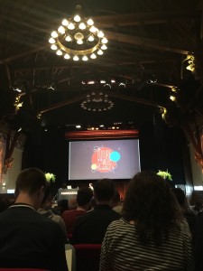
Big Eye Deers at #AwwwardsAMS
This may be a little late but hey, it’s been a busy month at BED HQ!
Back in January Ben, Steve, and I jetted off to Amsterdam for the Awwwards conference 2016. After learning so much at last year’s conference in Barcelona, we all had high hopes for AwwwardsAMS. Needless to say we weren’t disappointed! We also managed to squeeze in a cheeky night of cocktails in a secret speak easy bar, some culture in the Rijksmuseum and a meet up with our hosting partner – it’s a tough life!
[grid_2 class=”alpha”]


The 2 day conference brings industry leaders from all over the world to talk about all things Web and digital. There was a huge variety this year, from talks on VR to a demonstration on sketch notes. Our favourite (and most useful as an Ecommerce agency) was Vitaly Friedman’s (Co-founder of Smashing Magazine) ‘Dirty Little Tricks From The Dark Corners of eCommerce’. The talk was jammed pack with tips and tricks for super charging Ecommerce conversion rates, all backed up with some great stats and examples.
[grid_2 class=”alpha”]


At least estimate shipping and tax costs
An interesting feature that was outlined was to show a popup to new visitors asking for their shipping location and preferred currency. Once filled in, all shipping and tax totals can be calculated and shown to the user throughout the store meaning no surprise costs. The effectiveness of including delivery speeds and cost as part of shipping method descriptions was also an interesting point which we will be passing our to our clients.
Anticipate user doubt
The importance of catching user doubts before they happen is something that we always try to anticipate. Vitaly outlined ao.com as an example – they show a price match notice when a user highlights a product title on their store. This simple and unobtrusive piece of functionality reassures the user just as they are potentially about to check prices elsewhere. Another great idea that our clients will be benefiting from soon!
Make life easy for your users
The main goal of most ecommerce sites is to get your users to view and buy as many products as possible. We all know faceted, autocomplete search, related products, upsells, crossells etc, are great ways to allow users to access as many relevant products as possible. There are also some slightly more subtle things we can implement to help this too.
Clearly showing which products the user has already viewed / added to cart in product lists is a simple way to distinguish between content they’ve already seen and other products that may interest them.
Don’t mix contextual and plain product imagery, users ignore one or the other. Giving the user a choice between contextual images and standard product cut outs is a good idea.
Users don’t like pagination (slow) or infinite scroll (can never get to the footer)! The best approach is a mix between the two – auto load the first 3 or 4 pages on scroll then show a load more button.
Nobody believes perfect reviews
Remember the saying – if something sounds to good to be true…? Well, no surprises that the same applies to product reviews which are ‘too’ perfect. I know I’m always very skeptical of sites which only show 5 star reviews for products. Including a few bad or average reviews actually helps conversion rates so keep them in!
Another nice touch that Vitaly suggested was to include a brief summary of the key pros and cons of a product above the main reviews section. This allows the customer to quickly see what’s good and bad without having to trawl through lots of content.
Don’t make your customers feel like they’re missing out
Don’t show a coupon code field by default at checkout. If a user hasn’t got a coupon they feel like they are missing out, they might also go to Google to search for coupons and not come back if they don’t find one. Keep users on the site and hide discount code field behind a link.
Payment Trust
Interestingly secure logos (trustwave, norton etc…) don’t actually have much affect on user confidence. Norton is the most effective one even though it has nothing to do with web security. Add a padlock symbol to credit card form / order button acts as an equally effectively assurance.
[grid_2 class=”alpha”]


If you are interested in Awwwards and attending a conference, visit their website here.
Magento
eCommerce
Magento is the leading solution for eCommerce, and we’re specialists. Magento is easy-to-use, completely customisable and endlessly scalable.

Bespoke
Builds
We offer custom web development services for any requirement. Manufacturing from scratch, we deliver a project entirely tailored to your needs.

Working with brands nationally from our offices in Cardiff and Cornwall, our tenacious team of designers and developers deliver sophisticated results every time.


